
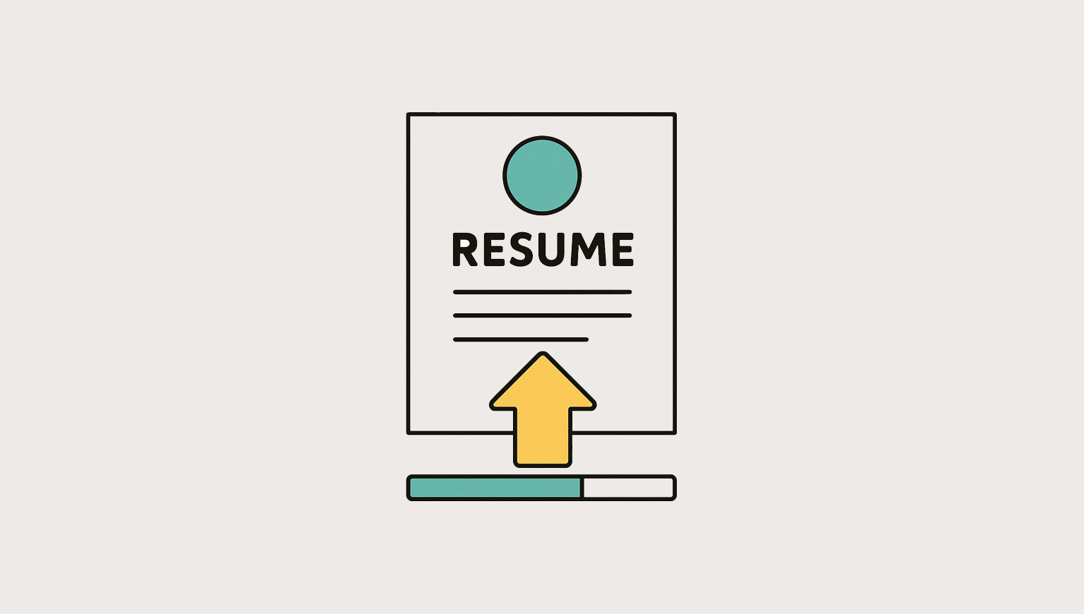
Did you know that up to 75% of resumes don’t get seen because they’re unreadable by ATS software? A beautifully designed resume won’t help if it can’t be parsed. That’s the gap many applicants fall into: a design that looks good but doesn’t get read.

Get hired faster with one of the top AI-powered resume builders.
Choose from recruiter-approved templates and instantly add pre-written phrases that highlight your skills and work experience. Trusted by millions—and free to use.
What is an ATS, and why should you care?
An ATS (applicant tracking system) is software companies use to scan, sort, and rank resumes before a human ever sees them. Popular systems include Workday, Taleo, Greenhouse, and iCIMS. These systems look for:
- Structure (headings like “Experience,” “Education”)
- Keywords that match the job description
- Job titles and dates to assess relevance and career progression
- Readable formatting and file types
The resume design dilemma
Many designers create two versions of their resume: one that’s “ATS-friendly” and one that’s more visually polished. On paper, it seems like a smart strategy—optimize for the system and still have something that feels like you.
But in practice, it’s clunky, time-consuming, and often unnecessary. Managing multiple versions creates friction. And more importantly, it misses the point.
The truth is, you don’t need two resumes. You need one that does its job well:
- Is readable by ATS systems
- Communicates your experience clearly
- Reflects good design through structure and hierarchy, not decoration
This article breaks down how to create a single, effective resume that works for both humans and machines, without compromising your design standards.
The myth of the ATS filter
There’s a persistent belief that if your resume isn’t perfectly formatted for ATS software, it gets auto-rejected before a human ever sees it. This idea has fueled a wave of fear-driven advice: avoid columns, don’t use color, and always submit a .docx file.
But the reality is less dramatic—and more nuanced.
ATS (applicant tracking system) software doesn’t evaluate your qualifications. It doesn’t pass or fail your design. Its job is simpler: extract your information—job titles, dates, skills—and map it into fields that recruiters can search and filter.
If the software can’t parse your resume cleanly, it doesn’t mean you’re rejected. It means your details might appear in the wrong place or be missed entirely when someone searches for relevant keywords.
That’s the risk. Not invisibility, but inaccuracy.
And while ATS parsing is imperfect, it’s not the biggest barrier. The primary reason many resumes are overlooked is that they’re difficult to scan. They bury relevant experience under vague language or over-styled layouts. They don’t connect the candidate to the job.
Hiring managers still review resumes. However, if yours isn’t structured clearly or doesn’t reflect the language used in the job description, it may never appear in a recruiter’s search. The system won’t reject you, but you’ll still be invisible.

The Figma resume trap
Figma is a powerful design tool, but it’s not built for structured document exports. When you use it to create your resume, you’re working against the grain.
The problems typically appear after export: bloated file sizes, text layers that break apart, and elements that aren’t selectable or readable. What looks sharp on your screen might show up as a fragmented mess to an applicant tracking system—or worse, to the person reviewing it.
This doesn’t mean you can’t use Figma. But it does mean you need to understand its limitations and design within them.
If you’re prioritizing performance and compatibility, tools like Google Docs, Word, or Pages are safer choices. They produce cleaner, more predictable outputs. If you’re comfortable with InDesign, you can make it work—if you know how to tag and structure the content properly for screen readers and parsing.
If you still want to use Figma, take these steps to reduce the risk:
- Stick to a single-column layout
- Use standard system fonts (e.g., Arial, Roboto, Calibri)
- Export as PDF (Standard)—not Print
- Test your file by pasting it into a plain text editor or running it through an ATS checker, such as Resume Now.
- Figma exports tend to be large; ensure your PDF is less than 3MB
From a Reddit user:
“I had a pretty two-column resume. Then I switched to a one-column layout and got way more traction. It was still visually clean, just way easier to read.”
This isn’t about playing it safe; rather, it’s about getting seen.
When “pretty” becomes a problem
It’s easy to assume your resume should look as “designed” as the rest of your work. However, many visual flourishes—such as two-column layouts, bar charts, icons, and a heavy use of color—often end up doing more harm than good.
The issue isn’t aesthetics. It’s legibility. When formatting choices compete with content, clarity suffers. And clarity is the whole point.
Many designers equate “visually engaging” with “effective,” but those aren’t the same thing.
Your resume isn’t a canvas for creative expression; it’s a tool for communicating value, fast.
Hiring managers aren’t grading your layout. They’re scanning for key signals: titles, skills, progression, and results. If they have to dig for that, you’ve already lost their attention.
From a Reddit user:
“I received 2,000 resumes in the first two weeks for my last job posting. Ain't nobody got time for pretty in wave one recruiting. So, whatever you do, make sure to include the keywords from my job post so the ATS can pick them up. As a hiring manager, I don't care about a pretty resume - you got the assignment wrong. Pretty is in your portfolio. I want an insanely good information hierarchy and readability in your resume. Keep it simple; the simpler, the better. I'll scan your resume for approximately 15 seconds if the first line and your employers' names catch my interest.”
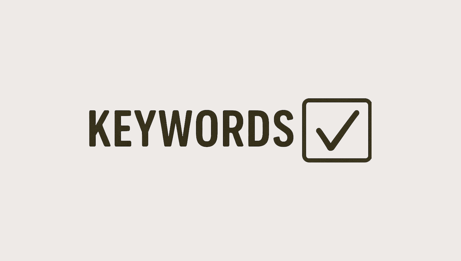
Keyword relevance > visual flair
A good resume should sound like a match.
Both ATS tools and recruiters use keyword searches to filter resumes. If your resume doesn’t include the right terms, it’s unlikely to show up, regardless of how well it’s designed.
Your resume must align its language with the role.
Here’s how to do it well:
- Analyze multiple job descriptions for the roles you’re targeting
- Look for patterns—specific tools, skills, job titles, and outcomes
- Use exact phrases, not variations (e.g., “project management” instead of “managing projects”)
- Include a “Skills” section with the most relevant and role-specific terms
- Weave keywords into your experience bullets in a natural, outcome-focused way
From a Reddit user:
“Keyword stuffing looks suspicious. But if you don’t match the job description language, you might never show up in searches.”
What a good resume design actually looks like
Design still matters—just not in the way most people assume it does. A well-designed resume doesn’t need to impress visually. It needs to read effortlessly.
This is where your design eye comes in—not to decorate, but to guide. The same principles you apply to interface design apply here: hierarchy, clarity, consistency.
Strong resumes don’t rely on visuals to stand out. They stand out because they’re easy to scan, easy to understand, and structured in a way that respects the reader’s time.
Here’s what that looks like in practice:
- A clear type hierarchy that separates sections, roles, and results
- Consistent spacing that gives the page breathing room
- A logical flow—typically Experience → Skills → Education
- Conventional section labels like “Experience,” “Education,” or “Skills” (not “My Story” or “Where I’ve Been”)
- Use plain formatting that feels considered, not like a default template.
From a Reddit user:
I’m a hiring manager, and I must say that the worst thing I experience with résumés is not having an actual hyperlink to your portfolio from your résumé. And if you have a password, please include it in very close proximity to your portfolio site’s hyperlink, ideally where I can find it easily. The way hiring software and platforms work disincentivizes me from considering you as a serious candidate if you don’t do these two things, especially if I have hundreds, if not thousands, of resumes and applications to review.
🔍 The resume that works checklist
Use this to sanity-check your resume before hitting send:
- ✅ Single-column layout
- ✅ Standard system fonts (Arial, Roboto, Calibri)
- ✅ .docx or standard PDF format
- ✅ No images, shapes, icons, or decorative bullets
- ✅ Contact info in the body, not in the header or footer
- ✅ Section headers that match ATS expectations (“Experience,” “Skills,” etc.)
- ✅ Clean visual hierarchy and consistent spacing
- ✅ Text that copy-pastes cleanly into a plain text editor
- ✅ File size under 3MB, some ATS platforms reject larger files
From a Reddit user:
“Use a plain single-column resume when applying in ATS. If you want a fancier resume, host it in your portfolio and send it directly to recruiters/people you network with, but don’t use it in ATS because it won’t work right. Especially don’t design a resume in Figma and then use that for applying in ATS, most ATS have a 3MB file size limit, and Figma exports are usually larger than that, so you won’t be able to use it. If you can use it, the ATS won’t be able to read it, so you will need to enter your entire resume in every application manually.”
Relevance wins
Design can make your resume easy to read, but relevance is what gets it noticed.
Even the cleanest, best-structured resume won’t perform if it doesn’t speak the language of the job post. Recruiters and applicant tracking systems rely on keywords to surface qualified candidates. If your resume doesn’t reflect those terms, you may never show up.
This doesn’t mean copying the job post word for word. It means mirroring the language that matters—skills, tools, job titles, and responsibilities.
Here’s how to do it well:
- Analyze 3–5 job descriptions for your target role
- Identify recurring keywords: tools, skills, outcomes
- Use exact phrases (e.g., “project management,” not “managing projects”)
- Create a dedicated Skills section that reflects the language of the role
- Weave relevant terms naturally into your experience bullets
And don’t force it. Keyword stuffing is obvious, and it makes your resume harder to read. The goal is to speak the same language as the role, not game the system.
FAQ: Fixing common resume issues
Why am I not receiving responses, despite having solid experience?
- Your job titles may not match industry-standard terms
- You might be missing keywords from the job description
- Your resume may not connect your skills to the role
Why does my resume formatting look broken after I upload it?
- ATS systems can’t read tables, columns, text boxes, or decorative layouts
Why is my experience or education section missing?
- Custom section titles can confuse the ATS software
Why aren’t my skills being recognized or showing up in searches?
- You may be using the wrong wording or burying key terms
Is it bad to have a two-page resume?
- No. If your content is relevant and clearly structured, two pages are fine. One page is a helpful constraint, not a rule. Don’t cut valuable experience just to fit an arbitrary limit.
Do I really need to tailor my resume for every role?
- If you want better results, yes. You don’t need to rewrite everything, but aligning keywords, job titles, and phrasing to the role can dramatically improve visibility and fit. Utilize tools like ChatGPT, Teal, or Jobscan to expedite this process.

One resume, done right
You don’t need two versions of your resume. You need one that works.
One that’s structured, reads easily, and reflects the language of the role you’re applying for. One that’s thoughtfully designed, not to stand out visually, but to communicate without friction.
That’s what gets you seen. And that’s what earns the next conversation.
Clarity is a design decision. Choosing the right tool is too. Let your portfolio showcase your creativity. Let your resume showcase your judgment.
The best-designed resumes don’t try to impress—they make it easy to say “yes.”