

In my last article with Family Style, I spoke with Hannah and Jess about branding as a competitive moat. They reminded me that the strongest brands don’t just look distinct, they think distinct, and that a sharp, ownable point of view (POV) is one of the hardest things for competitors to copy.
That conversation stuck with me. It made me curious about how POV shows up not just in brand design, but in product design itself. What does it look like when a product has a strong brand POV baked into its design? How does it feel different from one that doesn’t have a strong POV?
To explore this, I asked Family Style to share examples of companies with a strong POV. They not only provided a list but also explained the fundamentals of what a POV really is. This article builds on that foundation, diving deeper into how products like Discord, Oura, Todoist, and Figma bring their philosophy to life, and why POV is more important than ever in crowded markets.
There’s no shortage of good design out there.
There are endless places to get design inspiration.
Design is more commoditized than ever; patterns, aesthetics, and even whole feature sets are easy to replicate. It’s easier than ever to focus on craft and produce good design, but harder than ever to stand out. A compelling point of view (POV) is the one thing competitors can’t copy.
A strong POV isn’t just a mission statement, bold selection of colors, or layer of brand polish. It’s a belief about how a problem should be solved, a philosophy that shows up in every design decision, not just the brand language.
It says: Here’s how we think this should work. Here’s what you should value, feel, or do.
Some brands wear this loudly, while others do so more quietly. But the ones that stick with us always share a throughline: they are not just well-designed, they have conviction. A philosophy, mission, or way of looking at the world. Their POV shapes how the product communicates, looks, feels, and works, in ways that are consistent and unmistakable.
That’s why POV matters. Don’t mistake POV for decoration. A compelling POV is one of the most defensible design choices you can make.
POV ≠ brand veneer
When people talk about a product’s POV, it’s easy to confuse it with branding. A striking color palette, a clever logo, or a polished campaign can all make a company look bold, but none of that guarantees the product itself has a point of view.
A POV goes deeper than surface aesthetics. It is evident in the fabric of the product, in how it communicates, the feelings it evokes, the language it uses, the visual style it adopts, and the interaction patterns it employs. Each of these facets expresses the brand’s POV, and together they’re what make a product distinct and memorable in a sea of lookalikes and forgettable experiences.
A POV isn’t the same as visual expression. A product can look bold without having a strong POV, and it can also carry a strong POV without looking bold. Visual style and philosophical conviction aren’t the same thing.
The most memorable products don’t just look distinct, they think distinct.
Examples in practice
Once you start looking for it, POV is everywhere. It’s in the way products make you feel, the rules they bend, and the choices they consistently reinforce. Let’s explore a few that stand out!
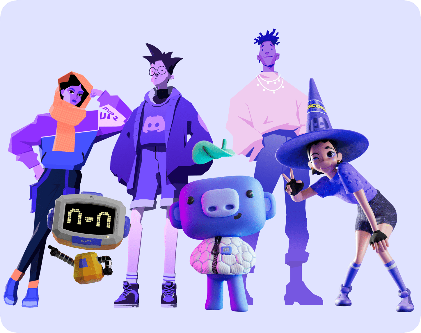
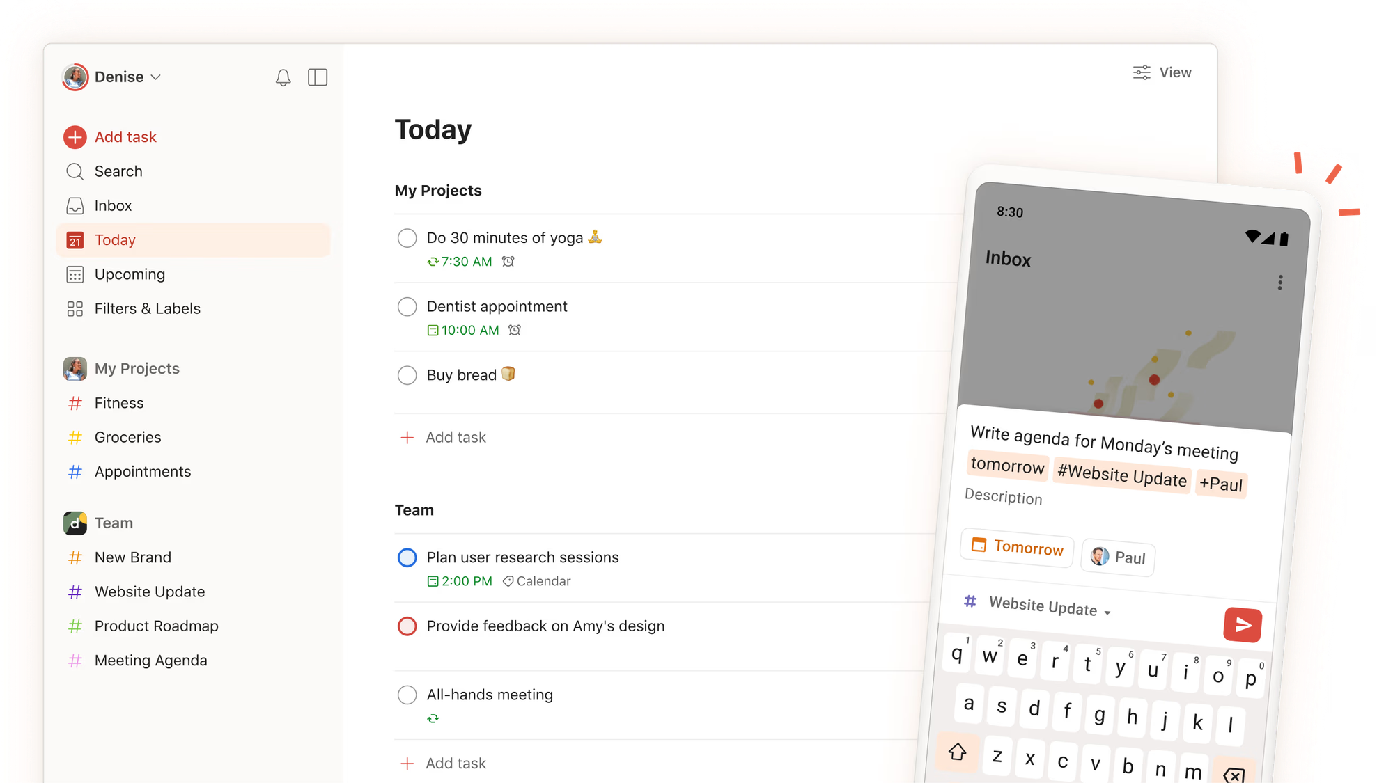
Discord
POV: Where the world talks.
Discord doesn’t feel like a polished social network; it feels like hanging out with friends. That conviction runs through every choice. Pseudonyms and avatars let you shape your own identity. Custom emojis, bots, and niche channels foster a sense of shared humor and camaraderie. Even the dense, layered UI feels less like a pristine app and more like a lived-in space where conversations overlap and energy spills over.
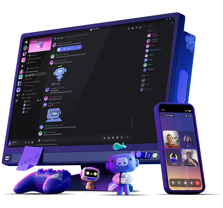
The visual identity reinforces this mood. “Blurple” hues, playful geometry, and the Clyde mascot signal an approachable aesthetic. Illustrations slip between 2D and 3D, often dropping into real-world contexts, which makes the product feel less like software and more like a cultural backdrop. Copywriting leans casual and enthusiastic, never corporate, making the smallest interactions feel personal.
The effect is intentional: Discord positions itself as the anti-social network, offering no ads, no algorithmic noise, and no pressure to perform. Instead, you get flexible tools to build the community you want, on your own terms. That choice, to design for belonging over broadcasting, is the throughline that makes Discord so distinct. In their branding and as a through line in the product, Discord creates an inclusive world where no one feels like an outsider.
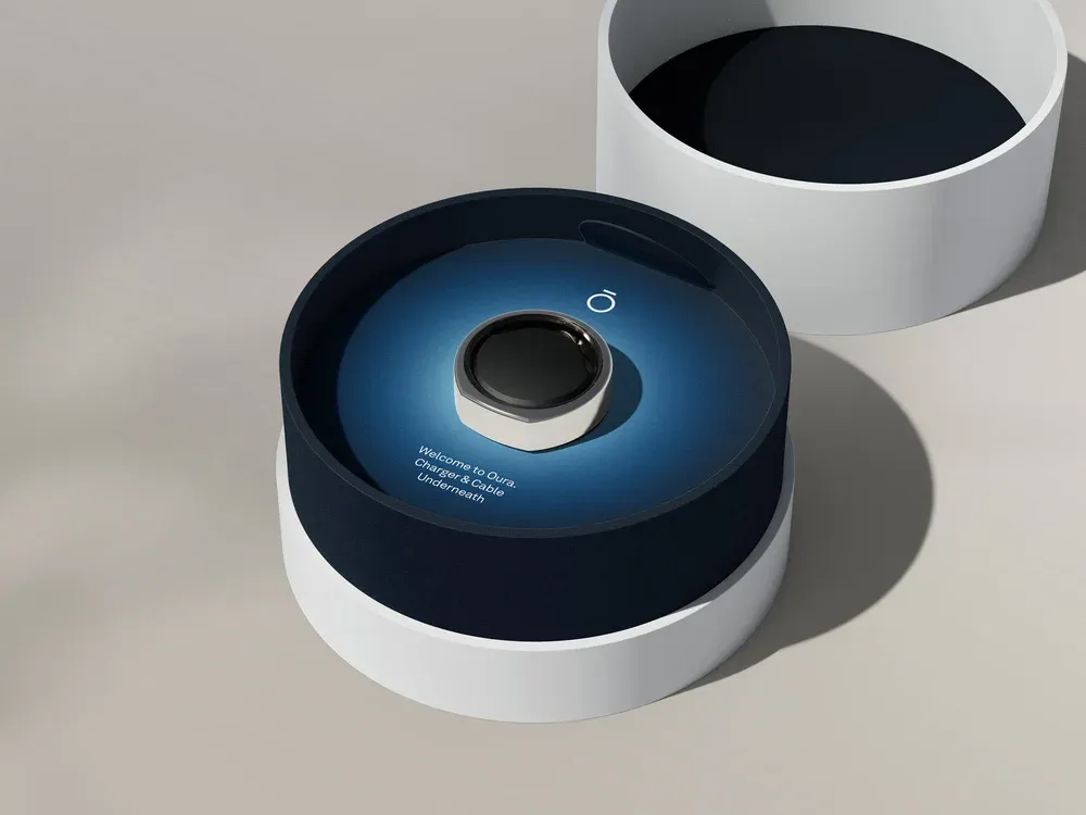
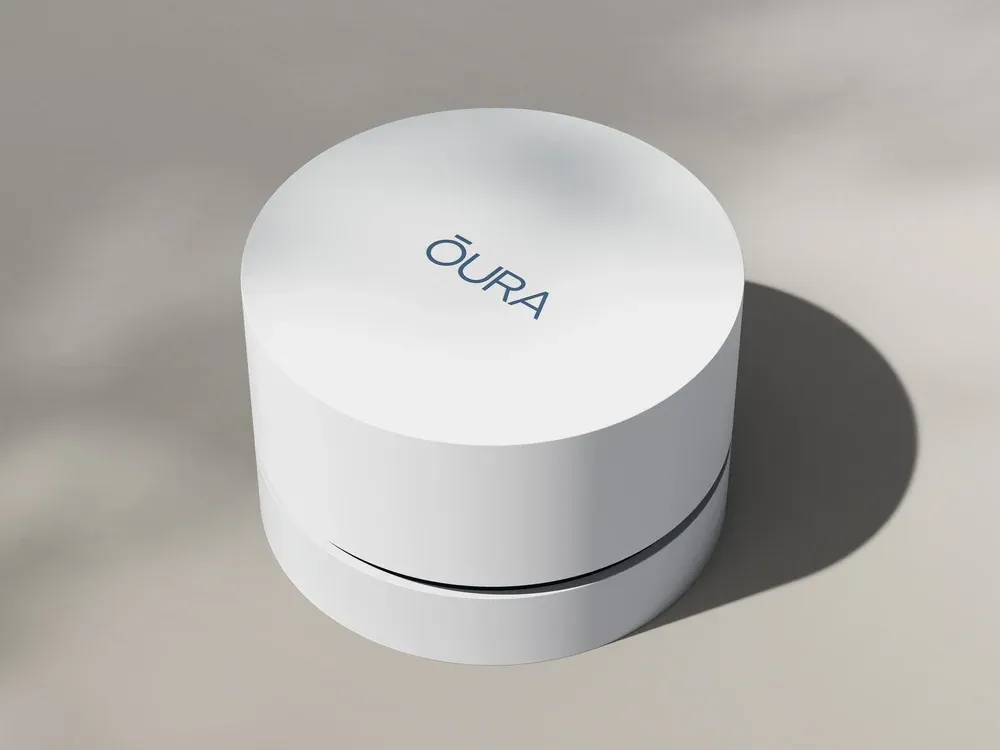
Oura
POV: Health is holistic, and you should be in charge of it.
Where most wearables shout “performance” with neon accents and dashboard-style charts, Oura takes the opposite approach. The ring itself is understated. A minimal object designed to blend into your life rather than stand out. The app adheres to the same philosophy: Nordic-inspired tones, quiet typography, and spacious layouts that evoke a restorative rather than clinical feel.
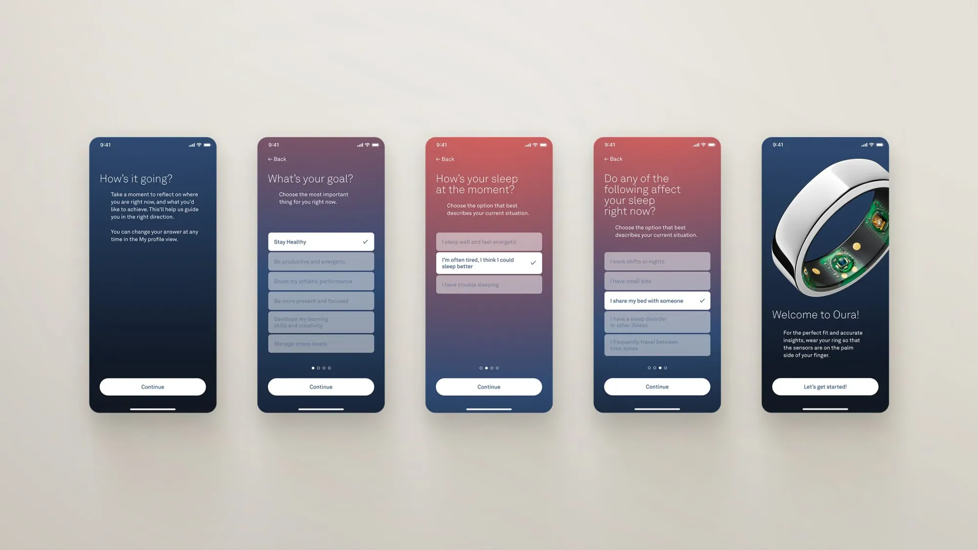
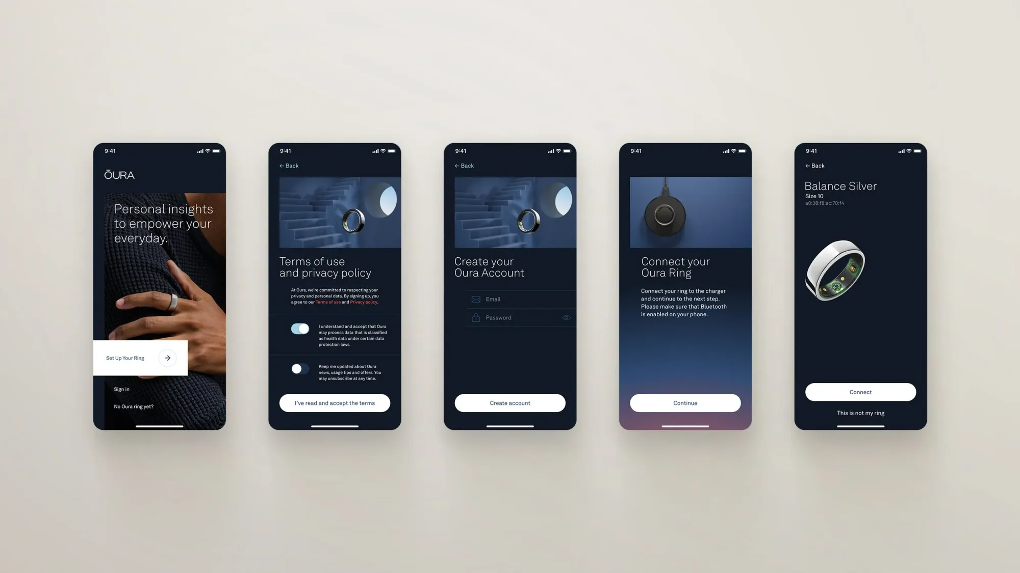
This restraint is intentional. Oura isn’t trying to overwhelm you with raw biometrics. Instead, it translates complex physiological data into simple, human stories: a readiness score, a recovery trend, a gentle nudge to rest. The language is calm and supportive, avoiding the hyper-competitive tone that defines so many fitness products. You don’t feel judged, but guided.
Even in their campaigns, Oura reinforces this perspective. From packaging to taglines, the focus is on clarity, empowerment, and balance, not hype or speed. Everything about the brand, from the soothing vowel sounds of its name to the ring’s circular form, aligns with the idea of wholeness.
The result is a product that feels less like a gadget and more like a wellness companion. By combining scientific rigor with elegant design, Oura positions itself as something rare in the category: technology that feels human.
Todoist
POV: Clarity creates momentum.
Todoist succeeds not by piling on features but by stripping them away. The app is deliberately minimal: a calm red-and-white interface, rounded typography, and a clean hierarchy that always brings the next task into focus. Where other productivity tools lean into dashboards, widgets, and complex tagging systems, Todoist rewards consistency and simplicity. Add a task, complete it, and watch your progress build.
That philosophy carries through in the details. Karma points and streaks encourage steady accomplishment without the heaviness of “gamification.” The language is clear and supportive, helping users feel in control rather than overwhelmed. Even the choice of red, often avoided in productivity apps, is reframed here as energizing, a visual cue that action is the goal.
Doist, the company behind Todoist, is known for running its business like it runs its product: focused on long-term focus rather than short-term hype. Remote-first, asynchronous, and globally inclusive, their culture echoes the same values of autonomy and calm progress.
The result is a product that quietly supports you without getting in the way. Todoist doesn’t demand your attention; it frees it up, helping you maintain a sense of calm and steady progress.
Figma
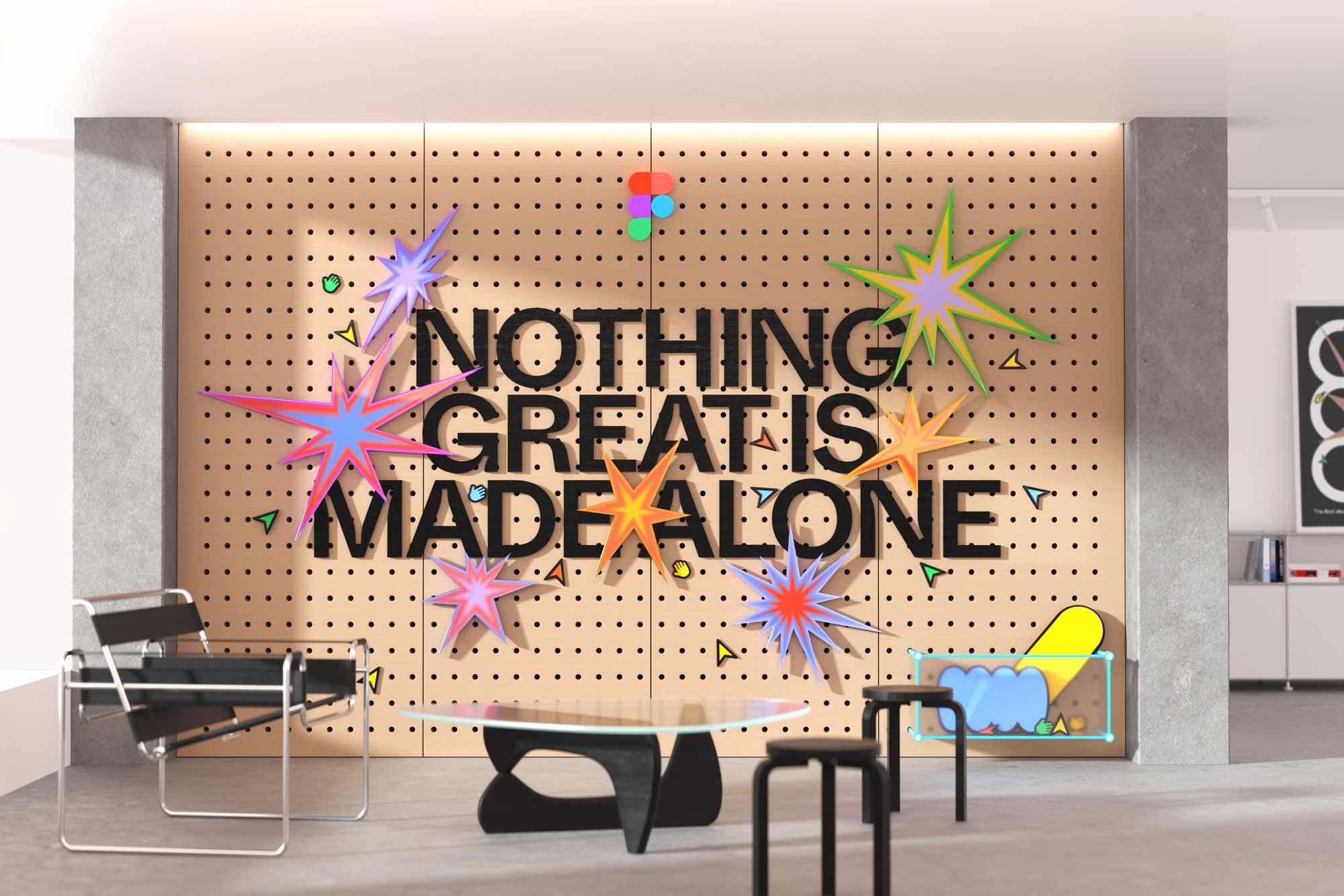
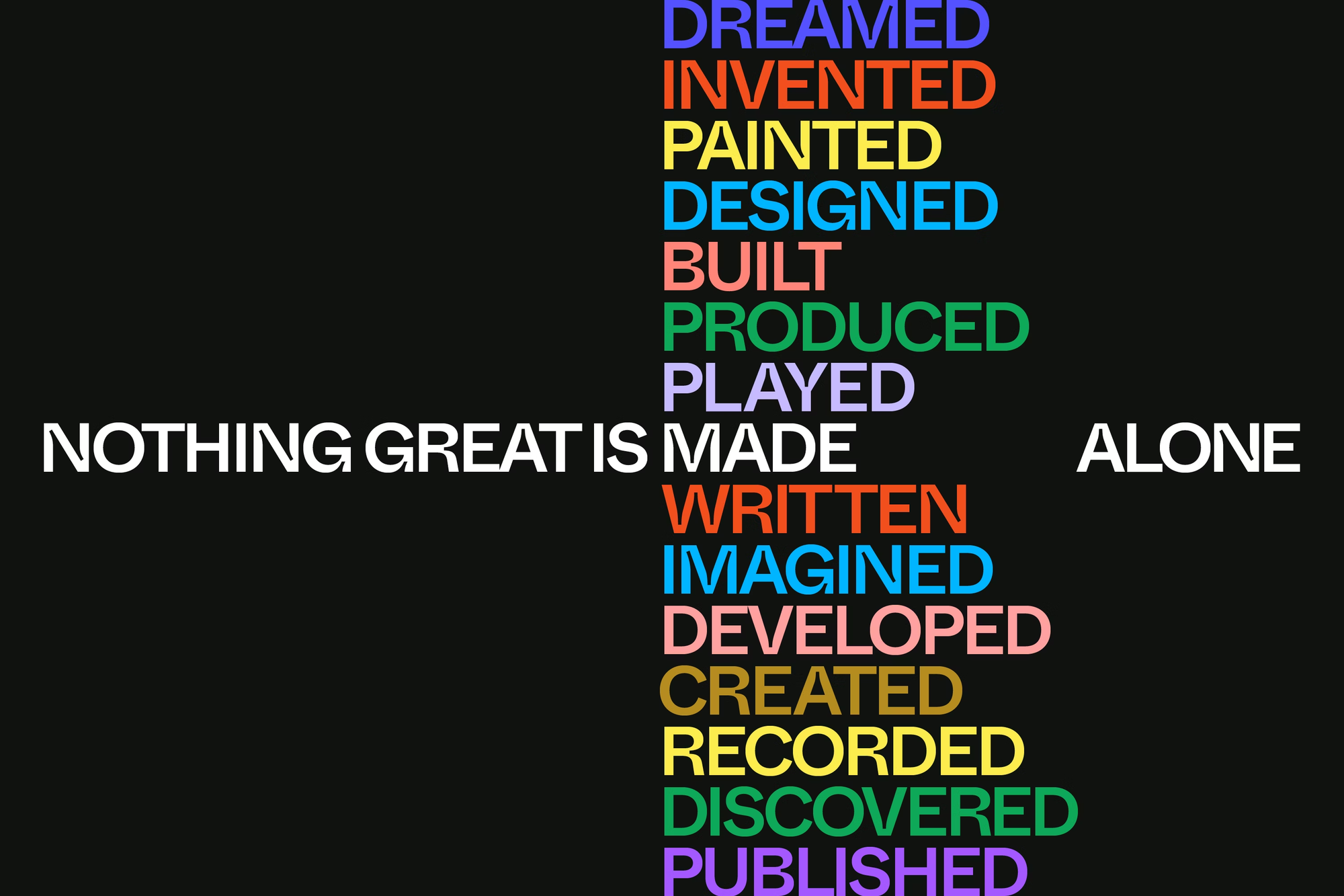
POV: Nothing great is made alone.
Figma’s conviction is simple but powerful: nothing great is made alone. From the beginning, the product has been built around a multiplayer design, with live cursors moving together on the same canvas, comments that live right inside the file, and sharing links that invite anyone in with a single click. Every feature is designed to encourage a collective approach to design rather than a private one.
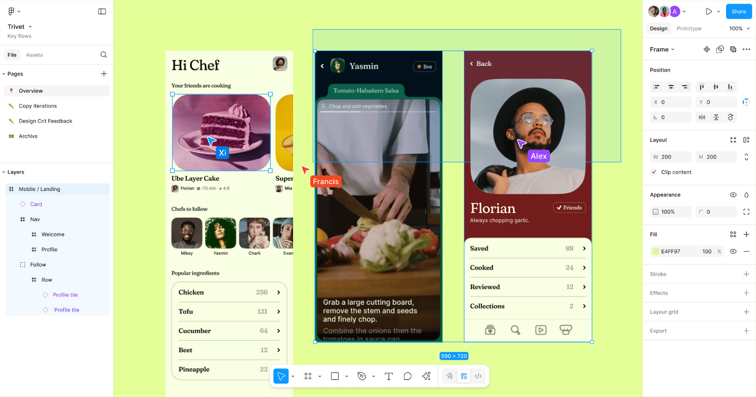
That belief extends beyond the tool itself. The visual identity is bold and expressive, featuring geometric shapes, vibrant palettes, and motion-driven elements that come alive when people work together. The playful touches inside the product, from avatars floating on the screen to stickers and confetti in FigJam, aren’t decoration; they reinforce the idea that collaboration can be fun, not just functional.

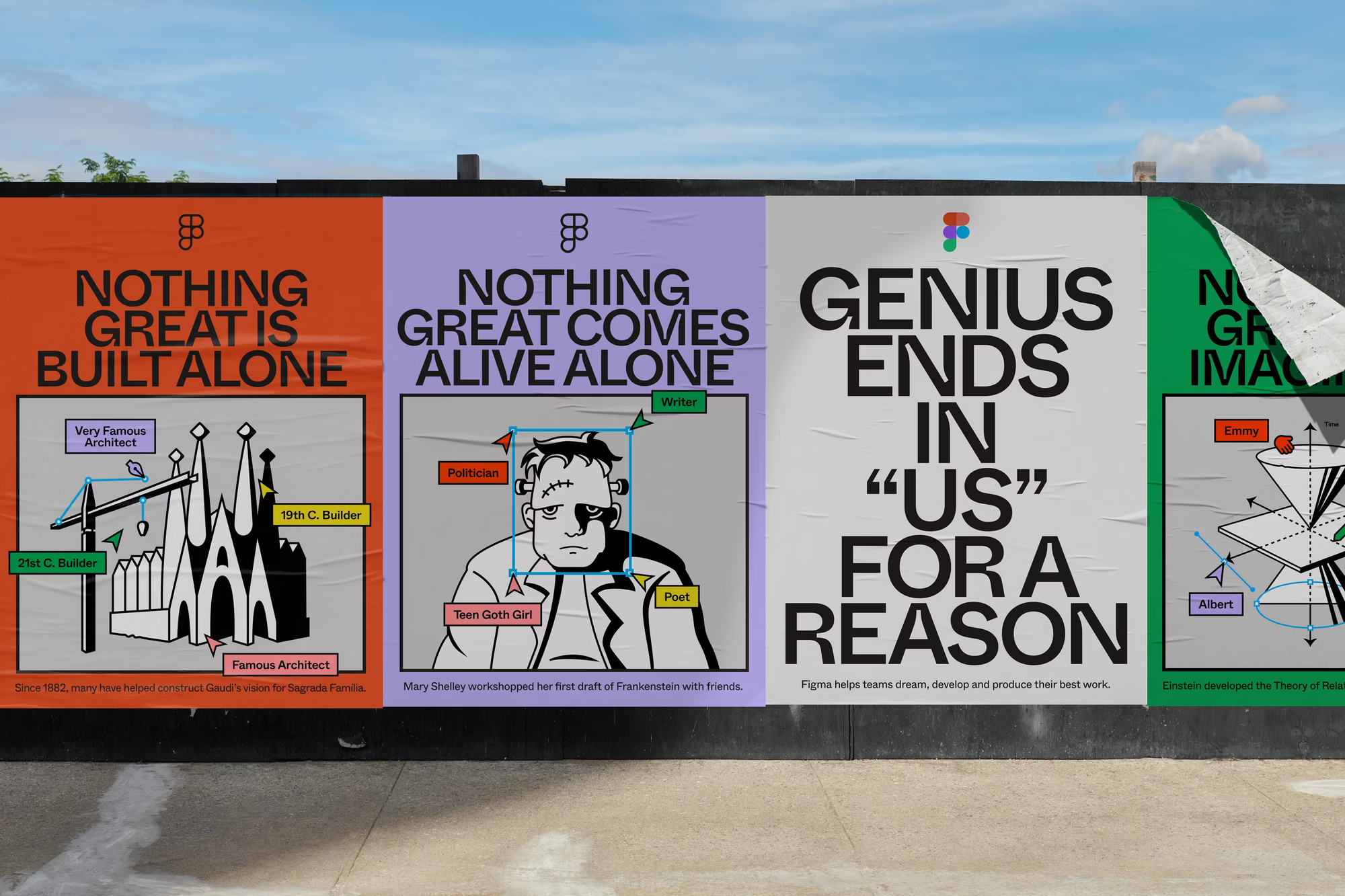
Figma also frames its community as part of the experience. Templates, plugins, and resources flow from users back into the product, creating a sense that the tool is co-built by the people who rely on it. In that way, the product isn’t just about designing in Figma, but designing with Figma.
The result is a platform that feels less like software and more like a shared creative space. Figma makes collaboration not just possible, but natural, which is what sets it apart.
Why POV is a moat
The truth is that most products don’t remain unique for long. Companies copy features, good design patterns spread fast, and even visual styles come and go. What can’t be copied as easily is the conviction behind your product, the belief that shapes every decision.
That’s where a strong POV becomes your moat.
A POV gives your product something more than just its looks or features. It’s the thread that runs through how you prioritize, how you communicate, and how you want people to feel when they use it. Others might mimic the interface, but they can’t fake the philosophy behind it.
That’s why products like Discord, Oura, Todoist, and Figma stand apart. Their POV isn’t an add-on; it’s what holds the whole experience together. And it’s what makes them memorable, even in markets full of near-identical alternatives.
In a space where feature parity is the norm, a clear point of view is one of the few things that truly lasts.
How to define and apply POV
Defining a POV can feel abstract, but it doesn’t have to be. Think of it as uncovering the belief that already guides your best decisions, then ensuring it shows up everywhere. Here’s a simple way to put it into practice: