
There’s been a bit of a kerfuffle around the new visuals Quartr dropped last week, and it’s a useful case study in how design, branding, generative AI, intent, and community reaction can align and clash.
Quartr, a financial research platform that shares earnings calls and investor materials, recently released a new set of visually striking visuals for major company earnings reports. The design community’s response has been largely positive, with many praising the fresh, attention-grabbing style, though some questioned whether the visuals feel original and fully aligned with the brand.

Some people are applauding
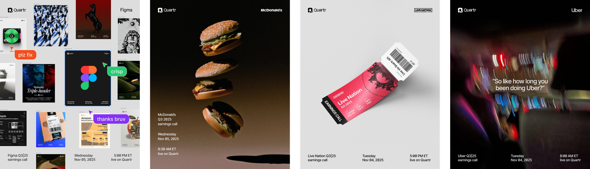
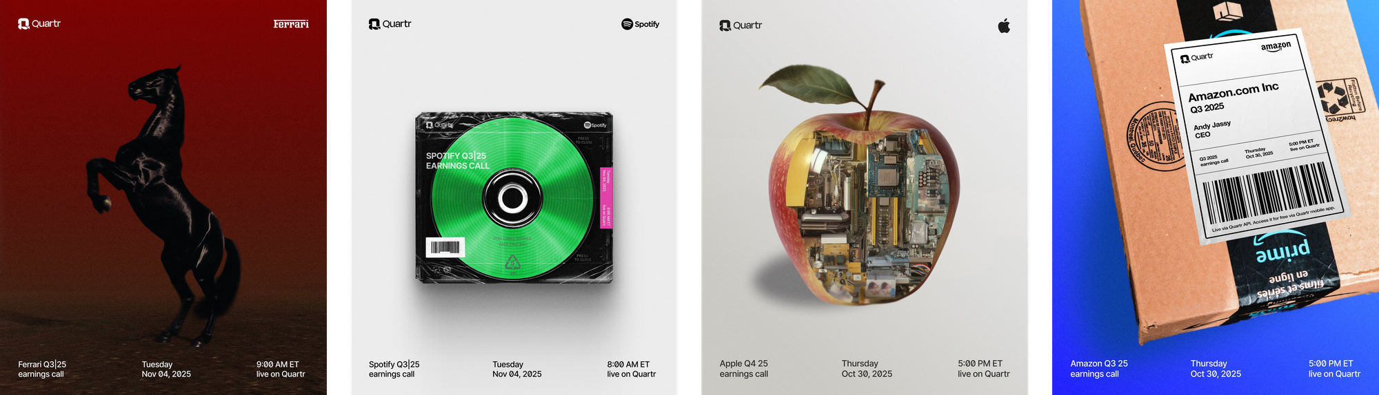
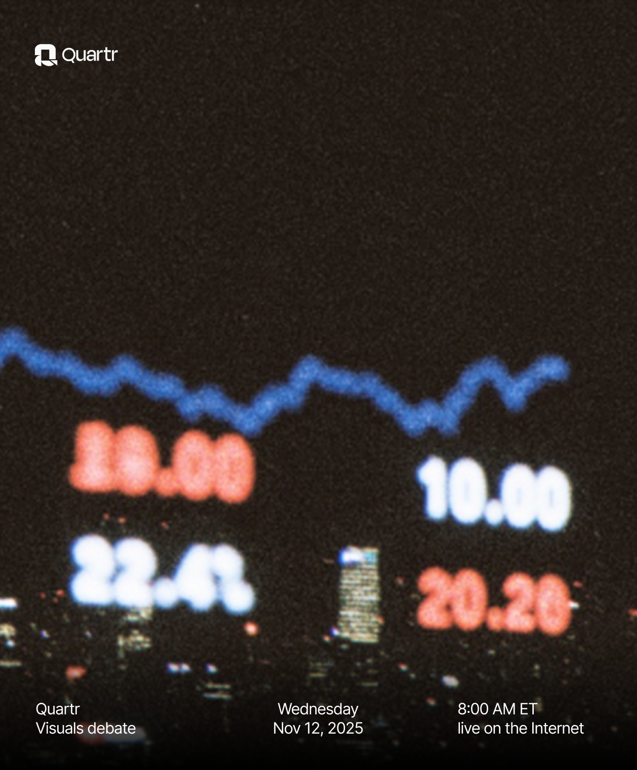
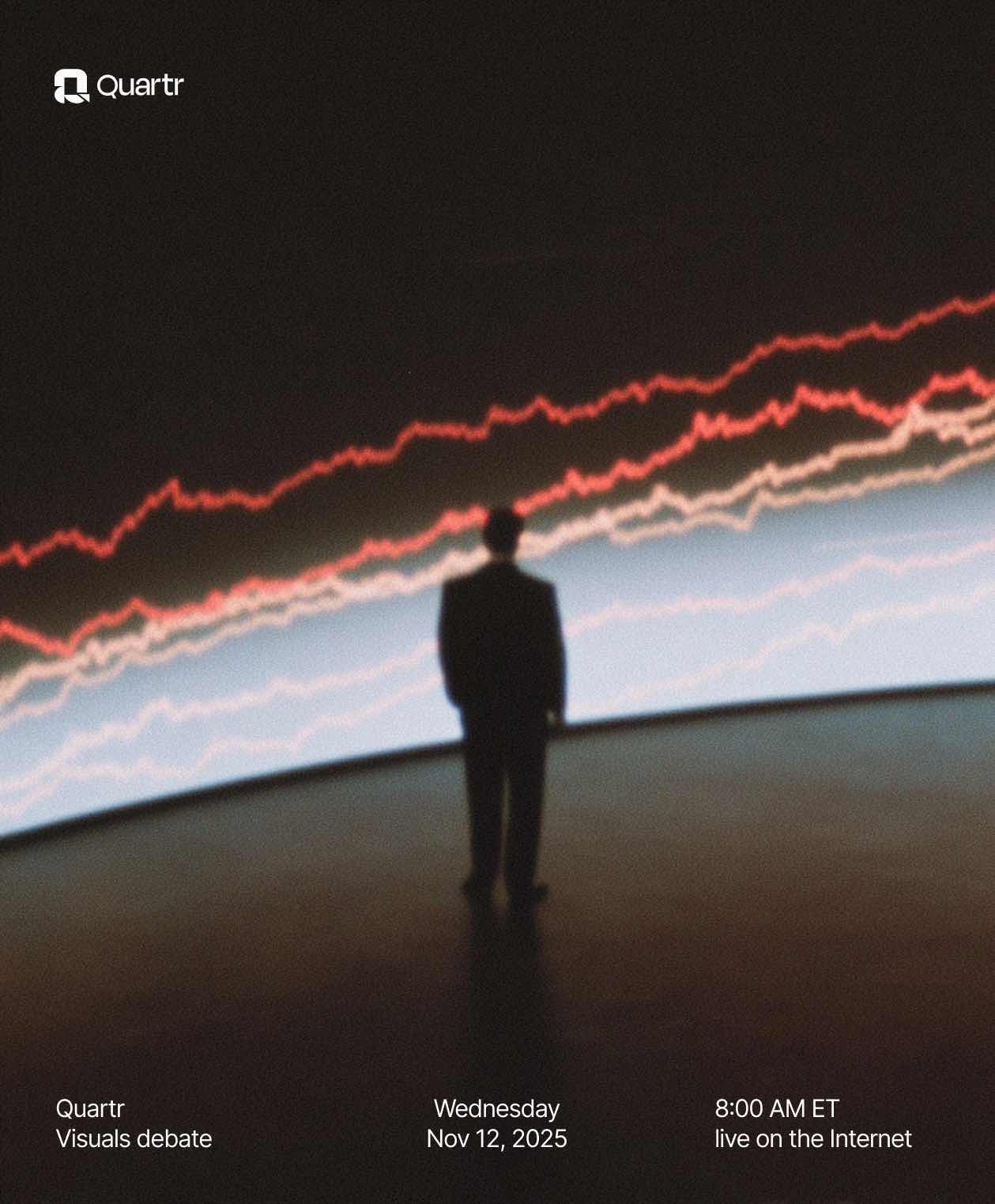
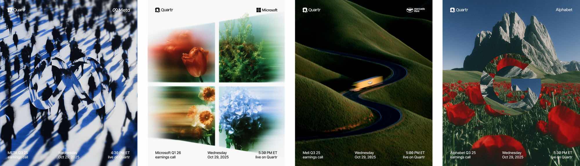
The visuals were created by designer Haris (@haris_chc) and brand strategist Oliver ೫ (@Prof_Kalkyl). Their goal seems clear: turn dry earnings reports into something that garners attention and feels cinematic. Each visual takes a minimalist, high-end approach that makes company updates look more like gallery pieces or album covers than financial announcements.
A lofty and interesting design challenge.
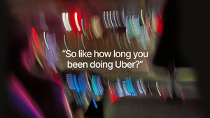
The series includes visuals for companies like Robinhood, Uber, Starbucks, McDonald’s, and Airbnb, each given the same refined, high-end treatment. The result is a series of visuals that blur the line between finance and culture, bold, sophisticated, and instantly shareable.
Designer Josh Puckett described the visuals as proof of what he calls uncommon taste and effort. The two things that separate good work from great work. Each visual, he noted, takes a simple idea and turns it into something distinct: a clever concept, composed with care, that feels both familiar and new. Rather than relying on a single template, the creators explored each one individually, creating a collection that feels intentional and cohesive.
Not everyone saw it that way.
Some people are criticising
The work wasn’t without criticism. Many noticed a distinct “Midjourney vibe,” and some were quick to point out that the visuals appeared to be made using the help of AI, a detail that, for a few, was a dealbreaker, though most didn’t seem to mind.
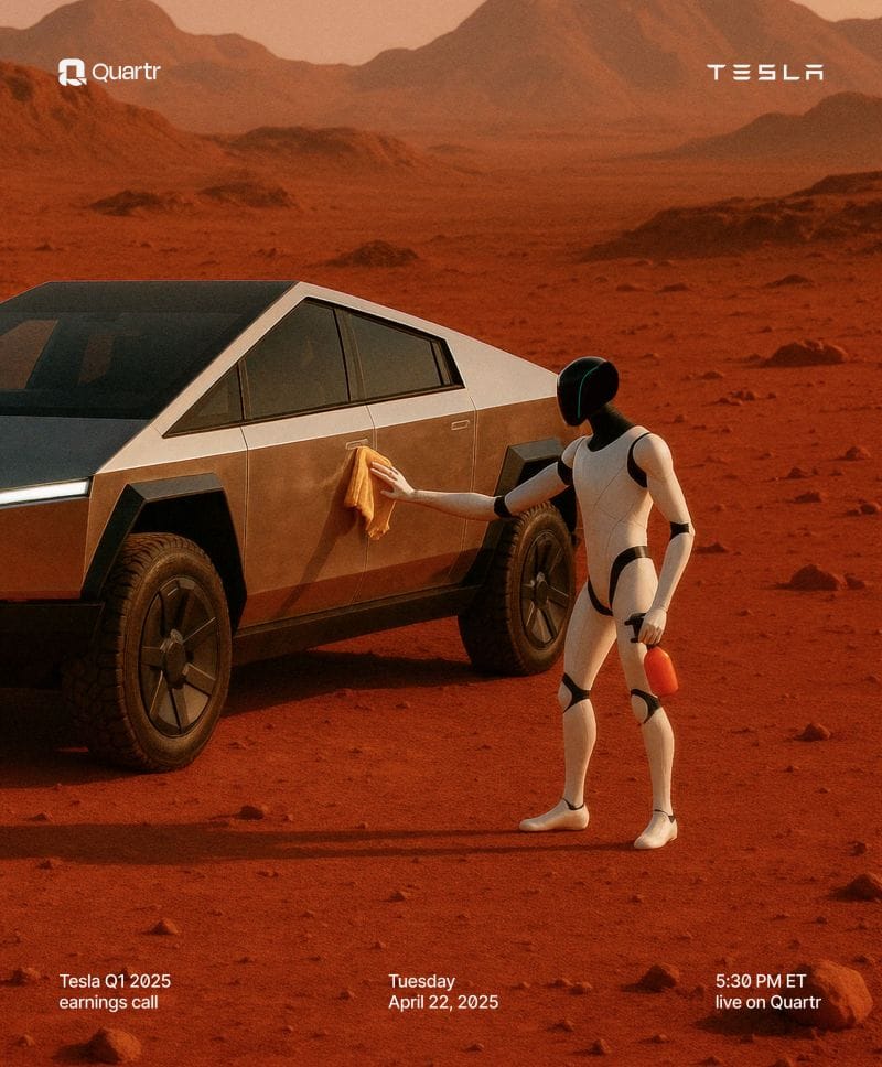
While no one from Quartr has explicitly said the visuals were made with AI, a post from co-founder Oliver Hamrin about six months ago suggests they likely were. In it, he shared a Tesla-themed graphic and noted that it was created “using a combination of ChatGPT 4o, Midjourney v7, and Figma.”
One of the sharpest critiques captured a broader sentiment in the design world:
“Founders already doing Temu versions of the hot design thing.”
It’s a biting way to describe how brands can rush to mimic the latest visual trends without the depth, thinking, or originality behind them.
For some, that’s what the Quartr visuals represent: design that looks premium and polished, but borrows an aesthetic that feels disconnected from the brand’s voice and purpose.
The fact that designers questioned their authenticity without any proof says something, too. It suggests the visuals fall into the uncanny valley: hard to tell whether they were made by humans, AI, or a mix of both; a place where aesthetic trends and generative tools overlap just enough to make us question.
Many took issue with the visuals not aligning with the product’s brand or aesthetic. And while that’s a fair critique, there’s also another side to it: If a campaign grabs attention and sparks conversation, isn’t that part of what good marketing is meant to do?
Creative strategist, Michael J. Miraflor, offered a more nuanced take. The problem, they argued, isn’t that the visuals might have been made with AI.
“Slop isn’t defined as being AI. All AI isn’t slop. Slop is a lack of consideration, culture, context, taste, or point of view. You can tell when something’s just the easy way out.”
Their point is that the issue runs deeper than tools. It’s about intention, distinction, and having a clear point of view. There’s always been derivative design, long before AI. The tools don’t make something good or bad; the thinking behind them does. When a design feels polished but hollow, or like it’s copying a vibe rather than creating one, it becomes what they call “premium mediocre:” visually impressive, but empty at its core.
They also cautioned against imitation. “The worst thing you can do is just copy this creative direction,” they wrote. “Develop your own point of view, that’s the point.” It’s a fair reminder that the Quartr debate isn’t just about AI or aesthetics. It’s about originality, discernment, and how easily visual trends can slip into creative shortcuts.
The design community’s enthusiasm even inspired others to experiment with the style. Creative Tatiana Tsiguleva, and creative ambassador at Perplexity, recreated a similar visual aesthetic by blending SREF codes in Midjourney, writing, “I love the colors and compositions in their recent posts, so I decided to recreate the style in Midjourney. Let’s see what I got.”
I created a few visuals inspired by the debate, using Tatiana’s SREF codes, Quartr on Quartr, you could say, and, well, they turned out pretty good.

Visuals I created using SREF codes in Midjourney
Also, brand designer Charlota noted that a startup recently commissioned her to create an entire AI-generated image library for their brand for $10k, the kind of brief that barely existed a year ago. Startups with limited budgets can now produce brand assets that once required large teams and timelines.
Personally, I think Michael’s perspective about having a point of view is right on. It’s something I’ve written about before with some incredibly talented brand strategists: a strong point of view is what sets a company apart. It’s the difference between a company that has no point of view and one that stands for something.

That said, I also think Quartr’s visuals did exactly what they were meant to do. They grabbed attention. They got people talking. And in that sense, the campaign succeeded; it raised awareness of Quartr through visuals that sparked curiosity, debate, and even controversy.
Maybe part of what’s fueling the debate isn’t how the visuals were made, but how good they are. We’ve seen plenty of AI-inspired work before, often easy to spot and dismiss because, frankly, it’s not that good. But these are different. They’re compelling. They show what’s possible when you combine generative tools with strong creative direction. And maybe that’s what really unsettles us. It’s not the tools themselves, but what they reveal: our fear of being left behind, replaced, or not good enough, and what that means for our sense of identity.
Looking at them together, it’s easy to see why opinions were split.
Some of the visuals have that unmistakable “Midjourney feel.” The hyperreal lighting, the textures, the slightly uncanny polish. But others show real creative thinking, turning a simple idea into something tactile, witty, and human.
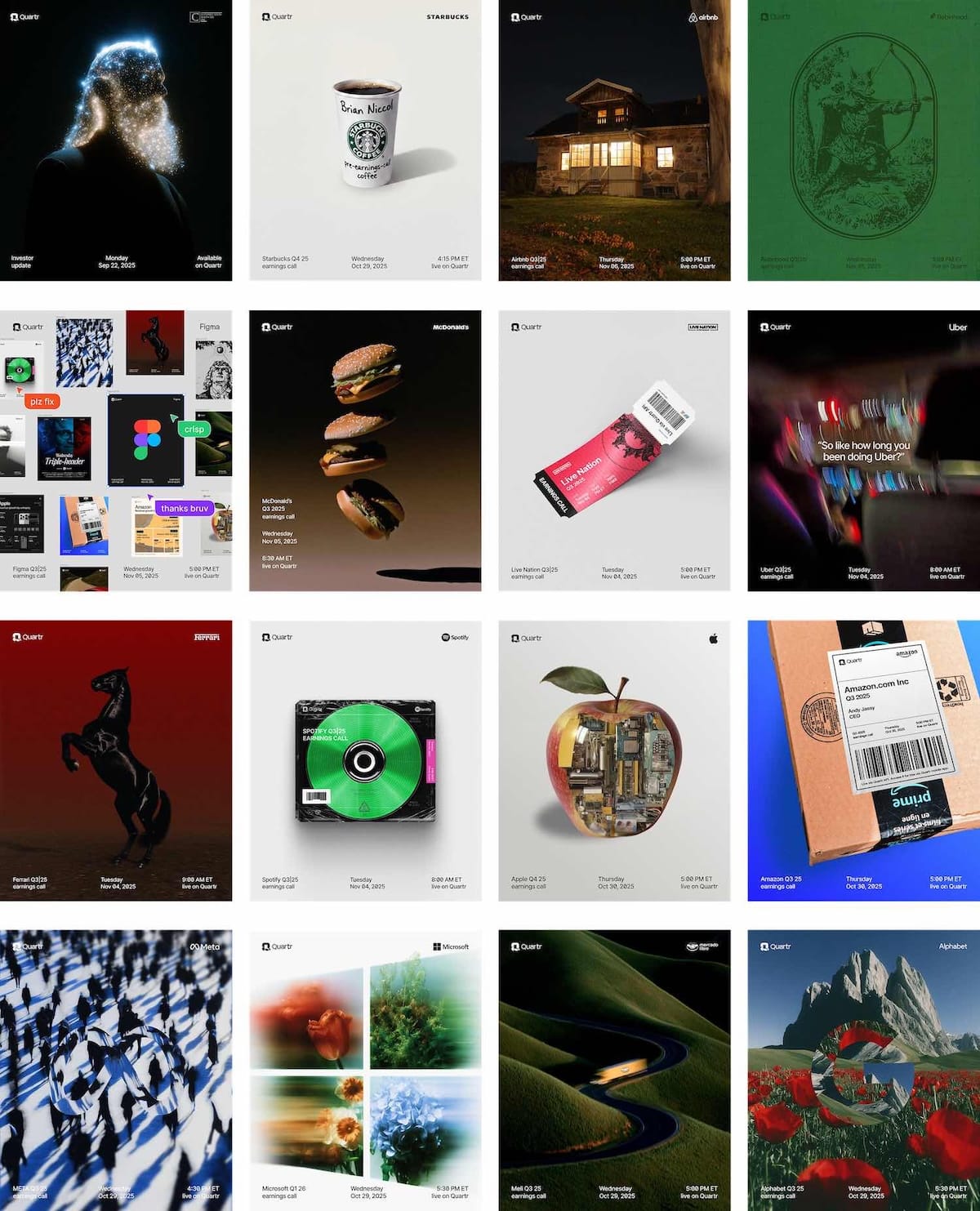
As a group, they actually hold up well. There’s a clear consistency in tone, style, and curiosity, with a high-end polish that ties them together and makes them feel like a family; a thoughtful, cohesive series that compellingly reframes corporate companies. The blend of AI-inflected surrealism and more grounded visual ideas gives the collection both range and personality. The real question now is where they go from here. Will they keep leaning into borrowed aesthetics, or will they evolve toward a visual identity that feels distinctly their own?
Whether you loved or disliked the visuals, the conversation they sparked reveals something important: we’re still collectively figuring out what originality means in an era where tools make it easier than ever to create. The real opportunity for designers is using these tools with intention while keeping originality top of mind.