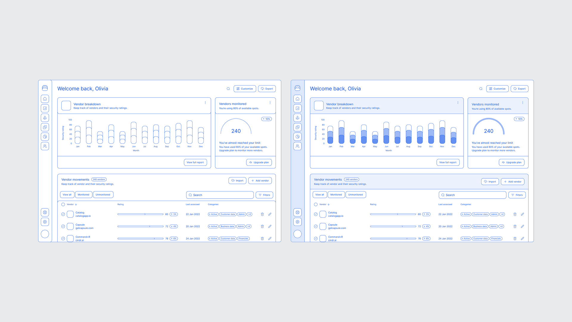
Designers sometimes find themselves in a surprisingly useful niche, where they need to defidelity a design, taking a high-fidelity screen and converting it into a low-fidelity, or skeleton, state. What might seem like a step backward is often a way to see the work more clearly and guide the conversation.
Moving between or mixing high and low fidelity is about communication. Adjusting fidelity helps you focus attention, clarify intent, and shape the kind of feedback you get. Sometimes you simplify to spotlight what matters most, and other times you add detail to draw focus to a particular change or idea.
And while rebuilding screens from scratch used to be tedious, several Figma plugins, which I cover in this article, now make it easy to convert high-fidelity designs into low-fidelity versions automatically. What was once a niche workflow has become a practical tool for the design process.
Refocusing attention on what matters
Low-fidelity visuals help communicate high-level concepts, overall ideas, and UX principles without the risk of people getting lost in UI details, keeping conversations focused on strategy and experience rather than aesthetics.
The feedback you get correlates with the fidelity you present to the audience.
The most compelling reason to lower fidelity is to refocus on function and user experience. When you present high-fidelity designs, people naturally react to details, color, typography, spacing, and iconography. Those details matter, but early in the process they can overshadow conversations about structure, flow, and purpose. Getting too pixel-perfect too soon can make it harder to see opportunities to strengthen the underlying UX approach.
Converting high-fidelity designs to low-fidelity—with clear intent and purpose—removes visual distractions and refocuses the conversation, making feedback more specific and actionable. Stakeholders are more likely to engage with how the design works: whether the flow feels natural, the hierarchy makes sense, and the overall structure supports the goal. A simpler presentation keeps discussion centered on usability and clarity rather than visual detail.
This approach also connects to a broader, more strategic use case.
A colleague recently described using defidelity not just for critique, but to communicate high-level ideas and UX principles within an existing product. By turning detailed Figma mocks into simplified “illustrations,” they could demonstrate feature opportunities, show where users encounter certain interactions, and focus the conversation on principles rather than pixels. It’s a smart way to turn existing design work into teaching material that helps teams see the bigger picture.
This idea gets to the heart of the topic and reveals an important nuance: when used intentionally, moving from high to low fidelity turns fidelity itself into a communication tool.
Designers can use a blended approach, combining high and low fidelity to focus attention on different aspects of the UI, communicate more clearly, and shape the kind of conversation and feedback they want to invite.
Blending fidelity
Presenting a hybrid design, where some parts are low-fidelity and others are high-fidelity, can be a powerful way to communicate in UX and product design. It helps you guide attention intentionally, keeping the discussion grounded in concept and structure while providing enough detail for validation and clarity.
Mixed-fidelity designs help you control where feedback lands. By intentionally keeping some areas low-fidelity, using simplified wireframes or grey boxes, you signal that those parts are still being explored and open to structural feedback. The higher-fidelity sections, on the other hand, make it clear which components are more resolved and ready for detailed or visual critique.
Example: high-fidelity inside low-fidelity
Adding selective high-fidelity details to a low-fidelity design helps you steer focus and make discussions more intentional. To illustrate, let’s say you’re working on a coffee map app and integrating photos from Google Maps for the first time. You want to show the team where those images might appear and how they affect the browsing experience.
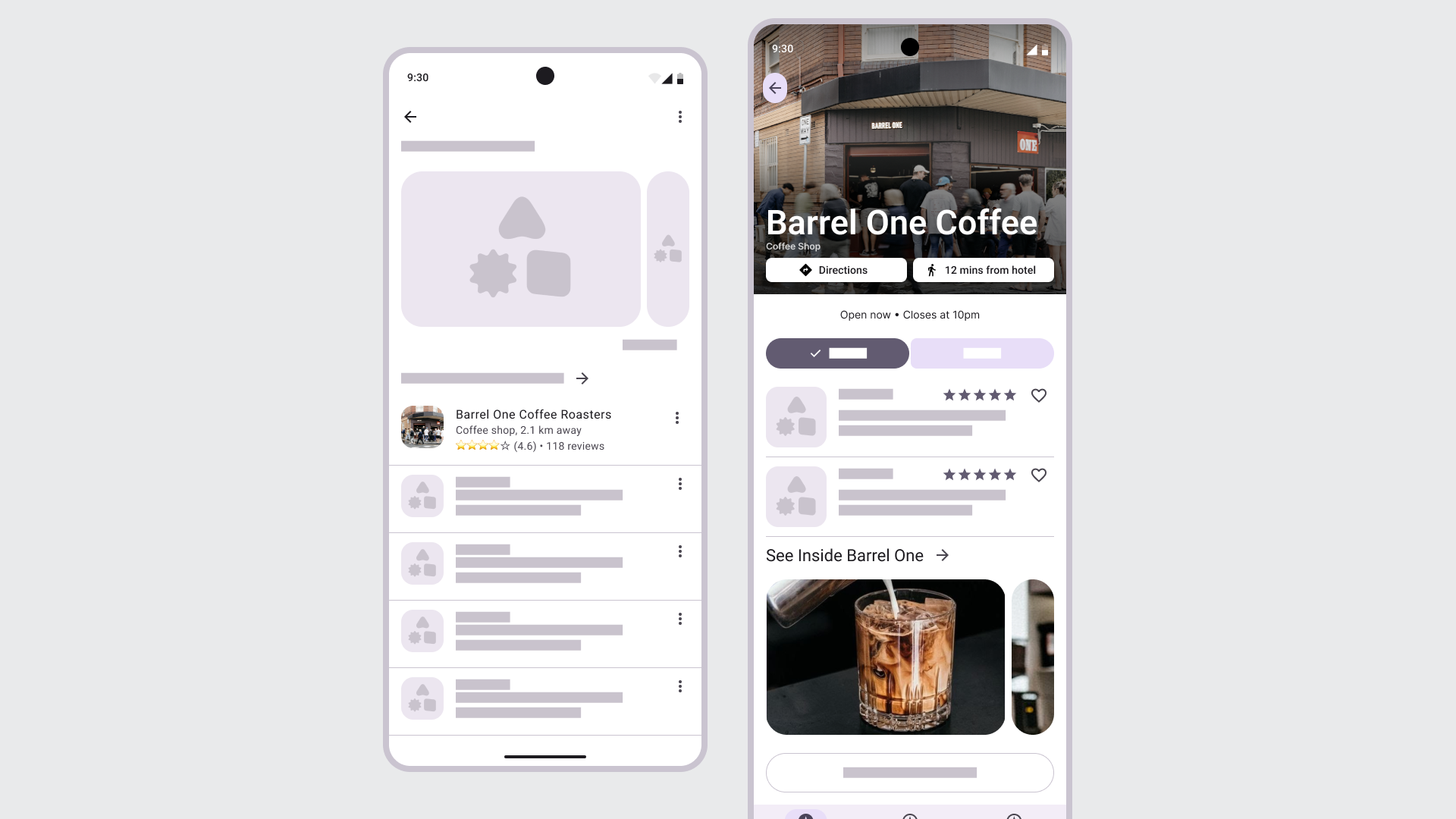
By keeping most of the layout low-fidelity, you draw attention to the role of imagery itself—how it conveys the brand and shapes how people move through an experience. This use of blending fidelities helps you steer attention so the team can focus on integrating visual content thoughtfully and, in turn, shaping a more meaningful conversation and feedback loop around its impact.
Use high-fidelity inside low-fidelity when you want to:
- Highlight and focus on a new element or change while cutting out distractions.
- Show how imagery, motion, or data affects the experience.
- Clarify hierarchy, focus, or visual weight in context.
Example: low-fidelity inside high-fidelity
Sometimes you want to combine low-fidelity elements, into an existing UI or design. This approach is useful when you want to show an early idea inside an existing, mature interface without suggesting it’s final.
In this example, most of the settings page remains in high-fidelity, while the new banner and announcement area are shown in low-fidelity. This contrast makes it clear where the new elements would appear and what they’re meant to convey. It signals that the idea is still being explored and focuses attention on the addition itself rather than the surrounding UI. It’s a quick, effective way to discuss placement, tone, and intent without suggesting the design is final.
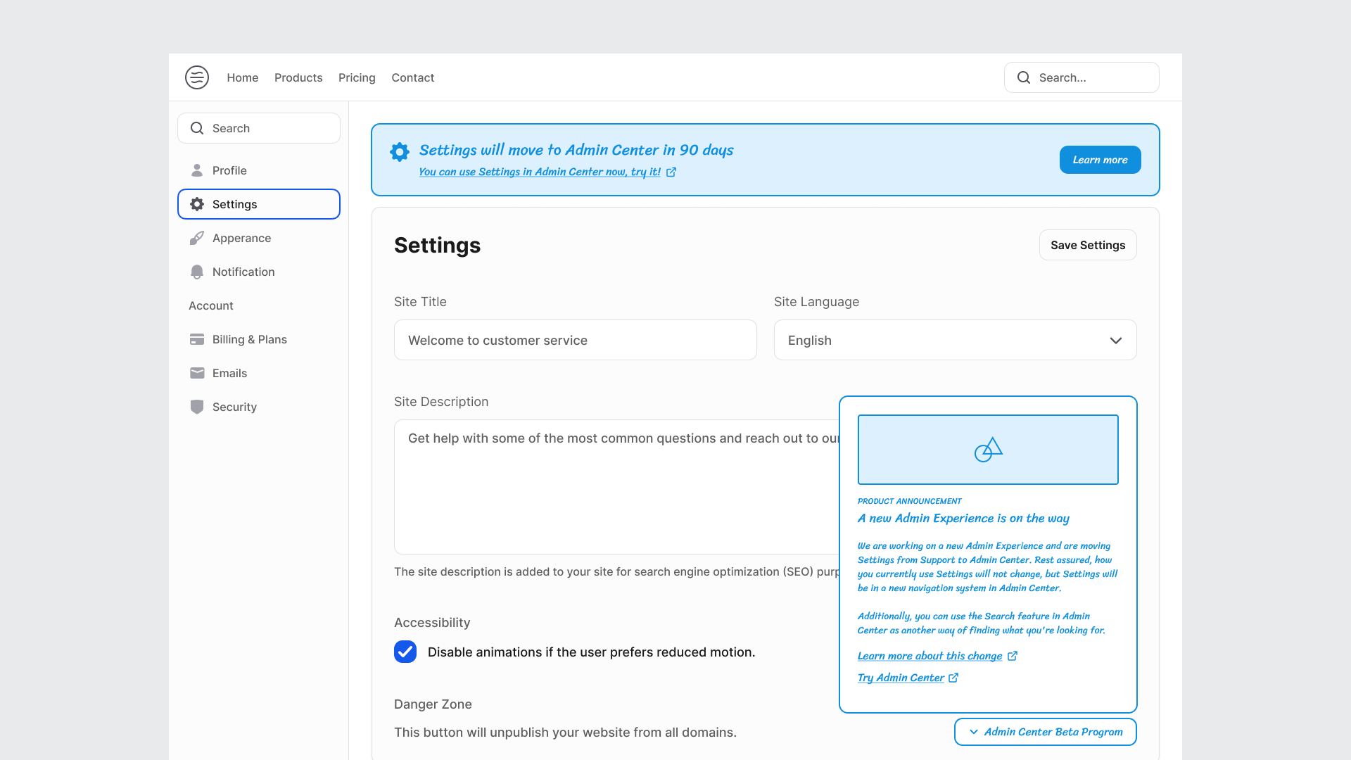
This approach is especially useful when producing multiple examples quickly for team, strategic or leadership discussions. By showing only the parts that might change, you can move faster, communicate intent clearly, and focus the conversation on the decision that matters, the why behind the addition, without spending time polishing every screen.
Use low-fidelity inside high-fidelity when you want to:
- Keep unfinished areas abstract to show they’re still in progress.
- Gather feedback on structure and flow without visual distractions.
- Test ideas or interactions before investing in polish.
- Signal that the design is still open to change.
The purpose of low-fidelity designs in the design process
Low-fidelity designs help designers work faster in the early stages of the design process, and they help teams think clearly and collaborate. They strip away polish so everyone can focus on what matters: the idea, structure, flow, and intent behind an experience.
High-fidelity designs can create a false sense of completion.
When a design looks polished, people assume it’s close to done. That perception can make it harder to have open, broader conversations. Converting a high-fidelity screen to a low-fidelity one reopens the space for reflection. It signals that the work is still flexible and that feedback is welcome on the fundamentals, not just the finish.
Guide the conversation
Lw-fidelity helps guide the conversation to where you want the focus to be. The fidelity you present shapes the kind of feedback you’ll get. Rougher visuals tend to surface bigger, structural questions (“Does this flow make sense?”), while more detailed mockups invite tactical or aesthetic critique (“Does this color feel right?”).
Reduce cognitive load
Keeping things intentionally low-fidelity can also reduce cognitive load for stakeholders. Without the distraction of color, type, or brand detail, it’s easier for people to follow the logic of a user flow or grasp what’s being tested.
Move fast!
Finally, low-fidelity helps teams move faster. When visuals are quick to change or discard, it’s faster and safer to explore. People are more open to trying new directions or challenging assumptions when the design is not final. This flexibility is especially valuable early in the process or when revisiting existing features, times when stepping back can reveal what the team may have overlooked.
Used this way, low-fidelity isn’t a step backward. It’s a deliberate pause that helps clarify structure, spark honest discussion, and keep the design process adaptive and grounded.
Figma plugins for converting high-fidelity designs to low-fidelity wireframes
After exploring when and why it helps to move between high-and low-fidelity, I wanted to see how well current plugins actually support that shift in practice. I tested a handful of Figma plugins that promise to convert high-fidelity screens into simplified, low-fidelity wireframes in seconds. Here’s how they performed, what worked well, and where they needed a little extra fine-tuning.
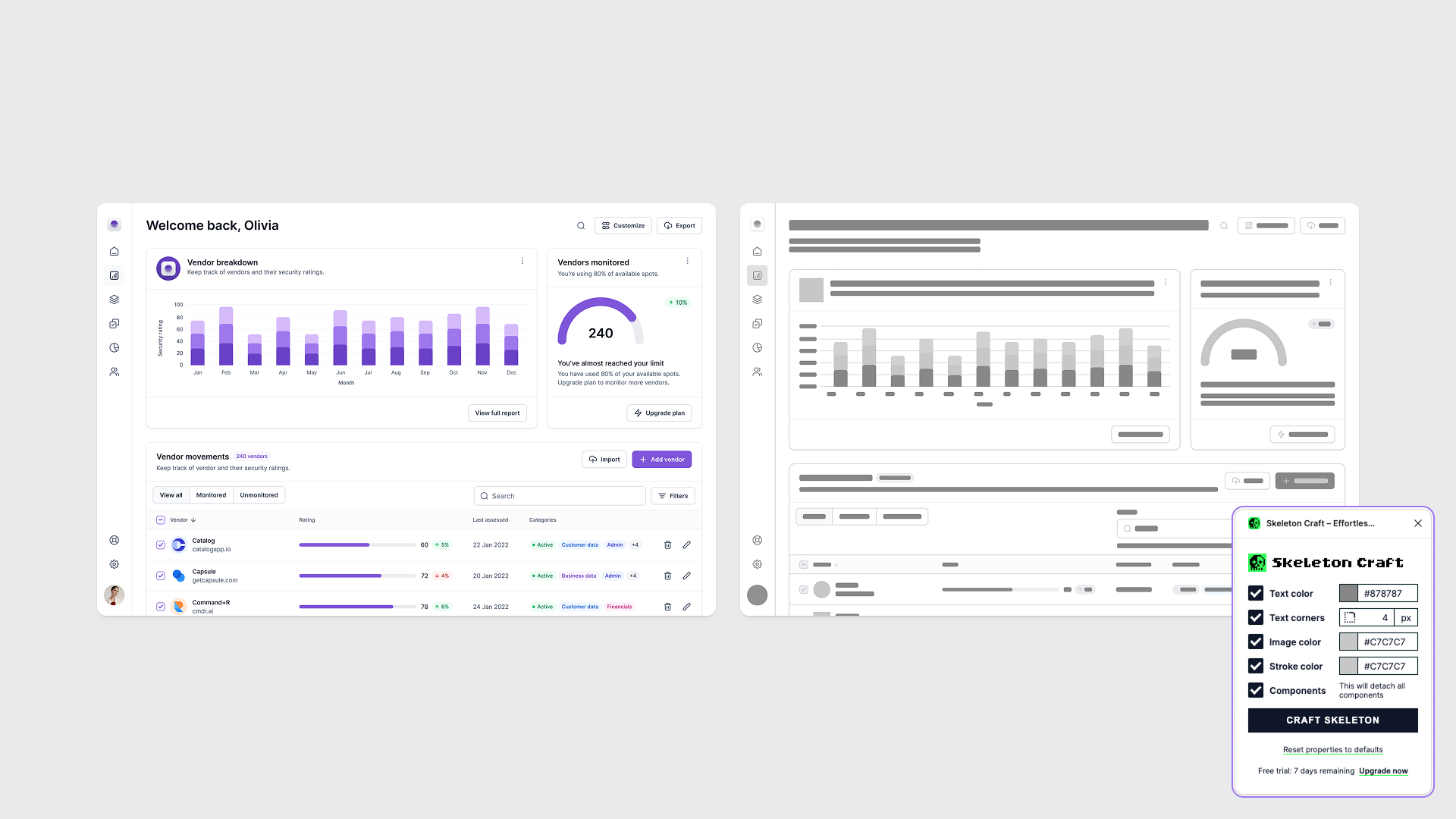
Skeleton Craft
Skeleton Craft quickly converts your Figma designs into simplified skeleton screens. It supports text, images, strokes, and inputs, letting you strip back detail while keeping layout and rhythm intact. It’s great for simulating loading states, creating minimal graphics for marketing or documentation, or showing structure without visual noise.
This was the first plugin I tried, and it worked pretty well. I had to make a few adjustments, but it was quick, and that’s to be expected. Once you reduce the design to two or three colors, it’s easy to adjust the entire UI. Skeleton Craft also offers a seven-day free trial.
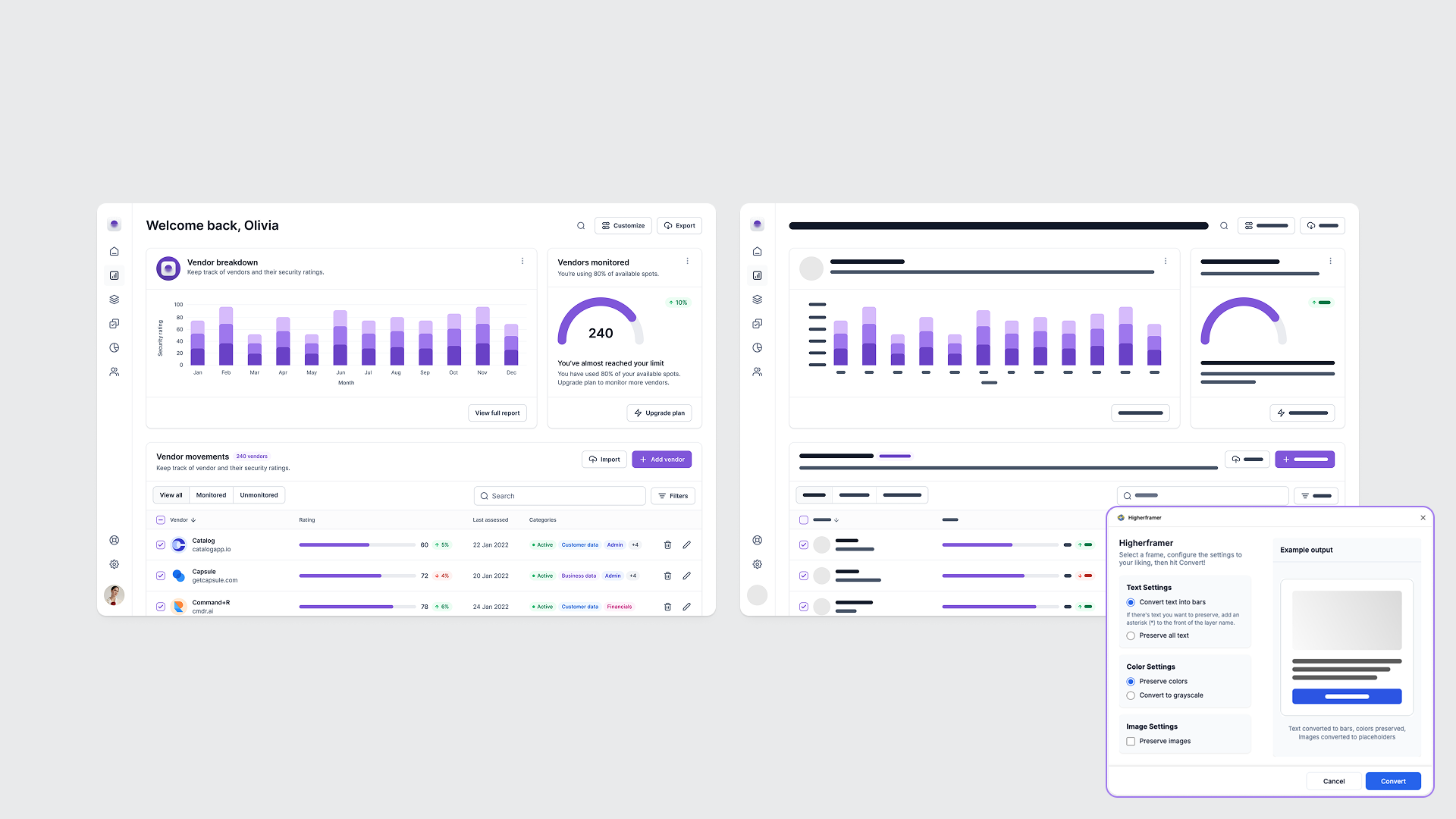
Higherframer
Higherframer lets you turn polished designs into clean wireframes with a single click. It’s designed for moments when you want to show structure, not style—whether you’re presenting a concept at a high level or reworking an existing feature from a fresh perspective. The plugin offers useful controls for preserving text, colors, or images, giving you flexibility over the level of fidelity to retain.
This conversion was a little smoother, and I didn’t have to adjust as much, but even when I do, it doesn’t take long. The result is a quick, tidy wireframe that looks intentional rather than stripped down, making it an efficient tool for reframing or simplifying high-fidelity designs for review. This plugin appears to be free.
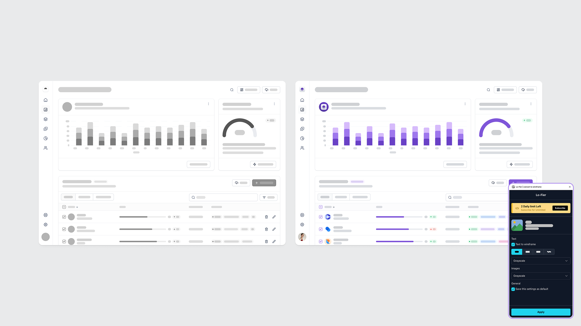
Lo-Fier
Lo-Fier transforms polished Figma designs into clean, low-fidelity wireframes with a single click. It’s built for fast iteration and early-stage feedback, converting text into simple rectangles and replacing images with neutral backgrounds or your choice of colors. You can tweak corner radii, adjust color palettes, and decide how much structure or abstraction you want to show.
Lo-Fier also worked well and might be my favorite. The out-of-the-box greyscale conversions are excellent, producing a balanced, minimal look right away. It also offers flexible options for color matching and image preservation, making the outputs more interesting and adaptable. This plugin has a two-conversions-per-day trial limit.
Wirebox
Wirebox stands out for its playful, boxy outline aesthetic. It gives your designs a distinct wireframe look with just one click. The default conversion color is an intense hot pink (which definitely gets attention), but I switched mine to blue for readability. I’m showing two versions here: one using only strokes, and another with partial fills for better contrast.
This was one of the more interesting plugins I tried, fun to use, and surprisingly fast once you tweak the colors. I did have to make some small adjustments to improve legibility, but the results were worth it. While the style may not be the most communicative for every use case, it’s a great option when you want to lighten the tone of a presentation or visually separate UX exploration from polished design work.
Building your own wireframes from scratch
If you’d rather create low-fidelity wireframes manually, there are some great resources you can find in the Figma Community. Google’s Material 3 Kit (Figma kit) is surprisingly effective. It’s structured, accessible, and flexible enough to adapt for quick concepting.
Typography can also help set the right tone for low-fidelity work. These fonts are designed to blend in with a wireframe-style vibe.
- Sriracha: a Thai + Latin handwriting typeface with an informal, loopless feel and sans-serif balance. It adds warmth and personality while staying clear and readable. Designed by Cadson Demak, Thailand’s pioneering communication design studio.
- Redacted: intentionally unreadable fonts for wireframing and prototyping. They replace dummy text with blurred or scribbled shapes, keeping the audience focused on structure rather than content. Designed by Christian Naths.
- Protest Riot: a creative type family by Octavio Pardo, inspired by the energy and imperfection of protest signs. The styles, Strike, Guerrilla, and Riot, share identical spacing, allowing you to vary tone and intensity without breaking layout.
Whether you start from a design system or assemble your own kit of visual building blocks, using consistent styles and wireframe-friendly fonts keeps your explorations fast, expressive, and focused on what really matters: the experience.
In the end, fidelity isn’t just about aesthetics or polish; it’s a tool for shaping conversations whether you’re stripping things back to explore structure or layering in detail to highlight intent, the level of fidelity you choose signals what kind of dialogue you want to have.
As tools make it easier to move between high- and low-fidelity, the real opportunity is learning when to do so and why. A well-timed reduction can clarify thinking, accelerate collaboration, and remind everyone that design is as much about exploration as it is about refinement.