Glassmorphism is everywhere in 2025, and Apple’s new Liquid Glass has taken it to the next level with real-time depth, motion, and adaptive contrast across all platforms. The style brings warmth and polish after years of flat design, but it’s not without drawbacks; accessibility, performance, and usability all need careful attention. Done with intention, it can add depth, hierarchy, and a premium feel; done carelessly, it risks becoming style over substance.
Glassmorphism has arrived in full force
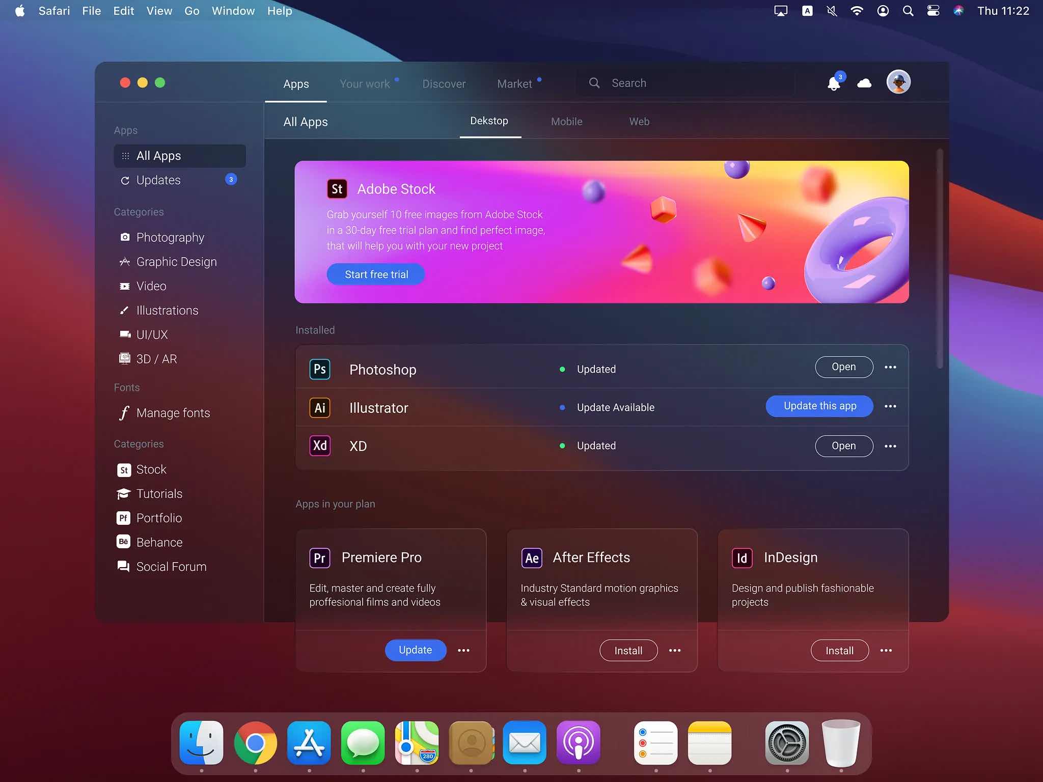
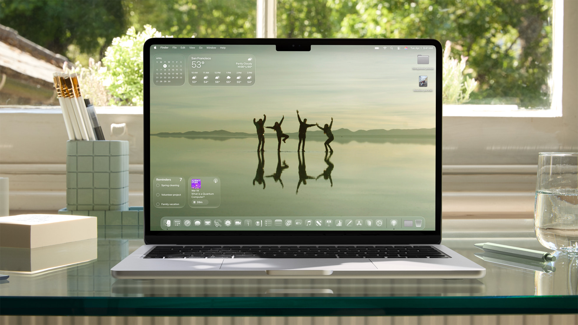
It feels like glassmorphism is everywhere in 2025. You’ve probably seen it without even realizing it, those frosted, semi-transparent panels layered over vibrant backgrounds in everything from fintech dashboards to creative tools. Apple’s introduction of its Liquid Glass design system has supercharged this trend, demonstrating what’s possible when translucent depth, refraction, and motion are all handled in real-time. Available on every major Apple platform, Liquid Glass adapts to context, content, and device motion, bringing a level of polish, accessibility, and consistency that the industry hadn’t seen before. The result is a style that feels both fresh and familiar, bringing back depth and warmth after years of flat interfaces.
Hey 👋, I’ve compiled over 25 practical resources, tutorials, articles, icons, plugins, inspiration, and CSS generators at the bottom of this post to help you get familiar with this evolving design language.
What is Glassmorphism?
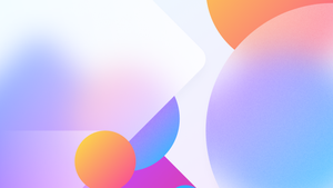
Glassmorphism is a visual style that combines transparency, background blur, and soft layering to create the look of frosted glass.
It often employs vibrant colors behind a glass effect, subtle borders to define edges, and light and shadow to make elements appear as if they’re floating. The term was coined by designer Michał Malewicz in 2020 and gained momentum when Apple introduced similar effects in macOS Big Sur. Unlike neumorphism, which relies heavily on soft shadows and minimal contrast, glassmorphism offers greater versatility, improved accessibility, and a brighter, more dynamic feel.
How Apple’s Liquid Glass moves beyond traditional glassmorphism
Apple’s Liquid Glass takes the familiar frosted, semi-transparent look of glassmorphism and elevates it into something far more advanced. Instead of static blur and simple transparency, it uses physically accurate lensing and refraction that respond to light, motion, and the user’s environment in real time. As you tilt a device or interact with the UI, highlights shift, shadows adapt, and glass surfaces subtly flex, creating a sense of physical depth that feels alive.
Where traditional glassmorphism often looks the same regardless of context, Liquid Glass actively adapts tint, opacity, and contrast based on what’s behind it, ensuring legibility and separation even in complex scenes. Apple has also unified this system across all platforms in its ecosystem, providing designers and developers with consistent tools, APIs, and motion behaviors by default.
Importantly, performance and accessibility have been designed in from the start. GPU acceleration keeps effects smooth, while dynamic contrast adjustments address the readability challenges that have long plagued glassmorphism. The result is more than just a prettier version of a trend; it’s a responsive, cohesive material system that blends realism, adaptability, and usability at scale.
Why glassmorphism is hitting hard in 2025
Tech finally caught up
For years, glassmorphism was more of a design fantasy than a practical choice. Blur effects and layered transparency were heavy on performance, so they stayed tucked away in concept work. Now, modern devices have the processing power to render them effortlessly, and CSS properties like backdrop-filter enjoy broad browser support. That means these effects look smooth, even on lower-powered devices, and can be implemented directly in production without slowing things down.
Platform validation
When Apple introduced glass-style panels into macOS Big Sur in 2020 and continued refining them in products like iOS and macOS, it lent the look credibility. Microsoft’s Fluent Design “Acrylic” materials did the same. Seeing the biggest platforms commit to glass effects reassures designers that the style isn’t just a fleeting experiment, but a well-supported visual language they can confidently use.
Flat design ran its course
After years of ultra-minimalist, flat design dominating digital products, many users are feeling “design fatigue.” Glassmorphism provides a softer, more layered alternative that keeps interfaces clean while adding warmth and depth. The frosted look feels less mechanical and more approachable, making it easier on the eyes while still maintaining a modern feel.
It signals quality
The complexity and finish of glass effects naturally give off a premium, high-tech vibe. That’s why you’ll see them in fintech dashboards, luxury brand websites, and cutting-edge apps; they convey a sense of sophistication and attention to detail. In an era where many products share the same design systems, glassmorphism enables brands to stand out without compromising usability.
It’s a stylistic upgrade
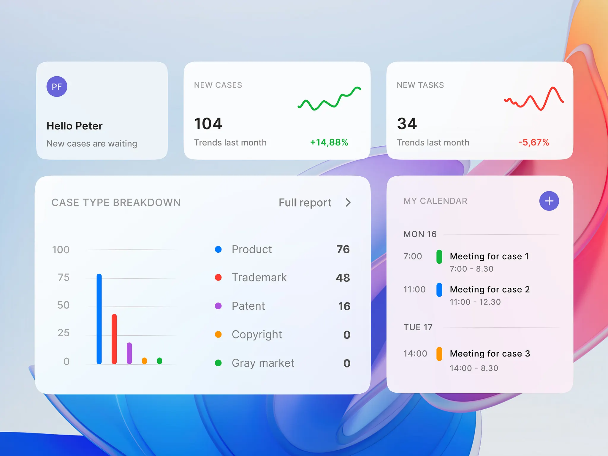
Glassmorphism is a functional style upgrade of sorts. Its layered transparency makes it easy to create a clear visual hierarchy without relying only on color or typography. Foreground panels stand out, but the blurred background still provides just enough context to help people understand their surroundings. Unlike opaque modals that block everything behind them, glass effects keep users connected to their environment, making the experience feel more natural and less disruptive.
This is especially powerful in complex products, such as dashboards, analytics tools, or multi-layered interfaces, where organizing information is half the battle. And it fits neatly into a broader shift away from strict minimalism toward what some call “minimalist maximalism,” interfaces that stay clean and functional while also bringing personality, depth, and visual richness. In the right hands, glassmorphism manages to be both beautiful and purposeful.
The critical perspective: where glassmorphism falls short
For all its visual appeal, glassmorphism has its fair share of critics, and their concerns are worth noting before you decide to use it.
Accessibility remains the biggest hurdle
Semi-transparent layers and blurred backgrounds can create serious contrast issues, especially over complex imagery. That makes text harder to read and can exclude users with visual or cognitive impairments. The style can also introduce motion or blur effects that cause discomfort for people with vestibular conditions.
It can be heavy on performance
Glass effects, especially real-time blur, are computationally expensive. On lower-powered devices or mobiles, this can lead to lag, battery drain, or the need for scaled-back effects. Not all browsers fully support the required CSS properties, which means developers must add fallback styles to ensure consistent results.
Usability suffers without discipline
When applied without care, glassmorphism can blur the lines—literally—between interface layers, making it harder for users to distinguish controls or navigate. Icon shapes can lose clarity, and readability can vary wildly depending on what’s behind an element.
Some see it as style over substance
Seasoned designers note that glassmorphism often thrives on platforms like Dribbble or Behance, but appears far less frequently in functional, production-level products. The criticism: it’s a cyclical design trend, more about novelty than solving real user problems, and risks looking dated in just a few years.
The takeaway: Glassmorphism can work beautifully, but only if you approach it with intention. That means designing for accessibility from the start, testing across various devices and contexts, and ensuring the style supports usability rather than distracting from it.
The mixed reception to Liquid Glass
Reactions to Apple’s Liquid Glass have been mixed and “passionate.” Some designers and beta testers view it as a bold evolution of glassmorphism, characterized by a polished, dynamic, and visually striking experience when experienced firsthand. Others are far less convinced, raising concerns about accessibility, usability, and overall design consistency.
Common themes
- Contrast and readability are the most frequent complaints, with some pointing out that even Apple’s keynote examples show text that’s difficult to read against dynamic or complex backgrounds.
- Form over function often arises, with comparisons to past design eras, such as Windows Vista’s Aero, which was beautiful in screenshots but harder to use in everyday contexts. As one person on Reddit put it:
“Looks like Apple had a Microsoft moment lol.”
- Icon color removal sparked pushback, as it reduces quick recognition and wayfinding for users who rely on distinct visual cues.
- Accessibility settings, such as “Reduce Transparency” and “Increase Contrast,” are seen as essential workarounds, although some worry that they aren’t obvious or enabled by default.
- Performance and environment concerns include potential battery drain, heavier GPU load on mobile devices, and difficulty reading elements in bright light.
- Inconsistent execution was another talking point, with some noting that Liquid Glass feels less cohesive than Apple’s VisionOS design language.
A smaller but vocal group believes this is a bold step forward and expects Apple to refine the design, just as it has with other controversial UI shifts in the past.
The overall sentiment is that Liquid Glass makes a strong visual statement. Still, its long-term success will depend on how well Apple can balance the aesthetic with usability, inclusivity, and performance in real-world use.
Best practices for using glassmorphism
Glassmorphism can add depth and polish, but without care, it can also make an interface harder to use.
Nielsen Norman Group highlights a few ways to get it right:
1. Meet contrast requirements
- Translucent elements can make text hard to read, especially over complex or multicolored backgrounds. Always check contrast ratios; tools like the Contrast plugin in Figma can help, so your text remains legible in every context.
2. Use more blur for busy backgrounds
- The busier the background, the stronger your blur should be. Trying to keep background details too visible can distract users and hurt readability. If you control the background, keep it simple; if you don’t, increase blur to maintain focus on the content.
3. Let users adjust transparency
- Whenever possible, give people control over contrast or transparency settings. Apple’s accessibility options, for example, allow users to reduce transparency or boost contrast, making glass effects appear solid for improved visibility.
The takeaway: Glassmorphism is most effective when it’s subtle, intentional, and accessible. Use it sparingly to create depth and visual hierarchy, and test it in real-world contexts to ensure it helps rather than hinders.
Looking ahead
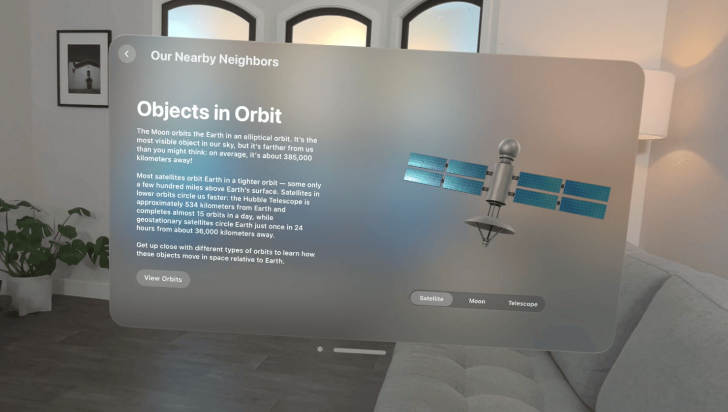
Glassmorphism isn’t just for today’s screens; it’s well-positioned for the next generation of interfaces. In AR, VR, and spatial computing, layered, semi-transparent panels help maintain depth and context without overwhelming the environment behind them. Apple’s Vision Pro, for example, utilizes frosted overlays to seamlessly blend interface elements into 3D spaces, allowing users to interact with information while still being able to see their surroundings.
As adaptive UI design evolves, glassmorphism could become even more dynamic. Imagine materials that adjust blur, opacity, and color automatically based on lighting, motion, or the complexity of what’s behind them. In this future, the style isn’t just decorative, it’s responsive, context-aware, and integral to how users navigate richer, more immersive digital environments.
How to get started with glassmorphism
The good news is you don’t need to build everything from scratch to try glassmorphism in your work. Figma plugins make it easy to preview and fine-tune glass effects right on the canvas, while CSS generators can give you ready-to-use code for the web. Many tools even let you adjust the blur strength, transparency, and borders in real-time, so you can quickly find a look that works.
Start small; design a card or a simple component before rolling out and practicing on an entire interface. That way, you can see how it plays with your brand colors, typography, and overall layout without overwhelming the design.
If you want to immerse yourself, I’ve curated a list of tutorials, articles, icons, plugins, inspiration, and CSS generators, so you can explore the style and start experimenting right away.
Dive in!