
Imagine this scenario: An agent quickly generates a working interface from a description, connecting screens and filling them with content. Once you start checking for inconsistencies, subtle issues emerge. You prompt the agent for improvements, but the back-and-forth doesn’t quite get you there. At some point, you realize you’d get to the result faster, and with more confidence, by exploring the solution yourself in a design tool.
As a designer, you often sense something is off before you know the precise value needed to fix it. You might need to see how 12 pixels and 16 pixels look in context before deciding which feels best. A design tool gives you room to explore those values as you work. Through prompts, each attempt means describing a change, waiting for an interpretation, and checking the result.
AI can speed up interface building while slowing fine-tuning. A more useful workflow gives designers direct control over refinements, then lets agents carry those decisions through the product.
Find the value by working with the interface
Consider a dashboard card with 24 pixels between its heading and description. The content feels disconnected, but you’re unsure exactly how much to reduce the gap.
Open the card in your browser, try 16 pixels, then 12, and compare the results. You can work through the options while keeping your attention on the card.
Chrome DevTools allows you to inspect elements and edit their CSS, including spacing, dimensions, and colors, in real time. By default, changes made in the inspector are temporary, so capture the values you want and ensure they’re saved to your source files.
Small edits directly in the code serve the same purpose. If you can locate the right component and CSS declaration or Tailwind class, you can tweak it and check the result in your running preview. Even a basic understanding of CSS gives you greater control over everyday design decisions, such as padding, gaps, type size, line height, and alignment.
If you find yourself experimenting frequently, ask the agent to build a small playground where you can adjust spacing, color, and corner radius while previewing your cards and buttons. The controls could use your existing design tokens to keep the available choices consistent with your design system.
DialKit, for example, is a library for adding live controls to an interface. Once you connect those tools to values in your code, its sliders and color pickers let you adjust them while watching the results. Its documentation includes examples for tuning grid gaps, padding, card radius, and animation timing.
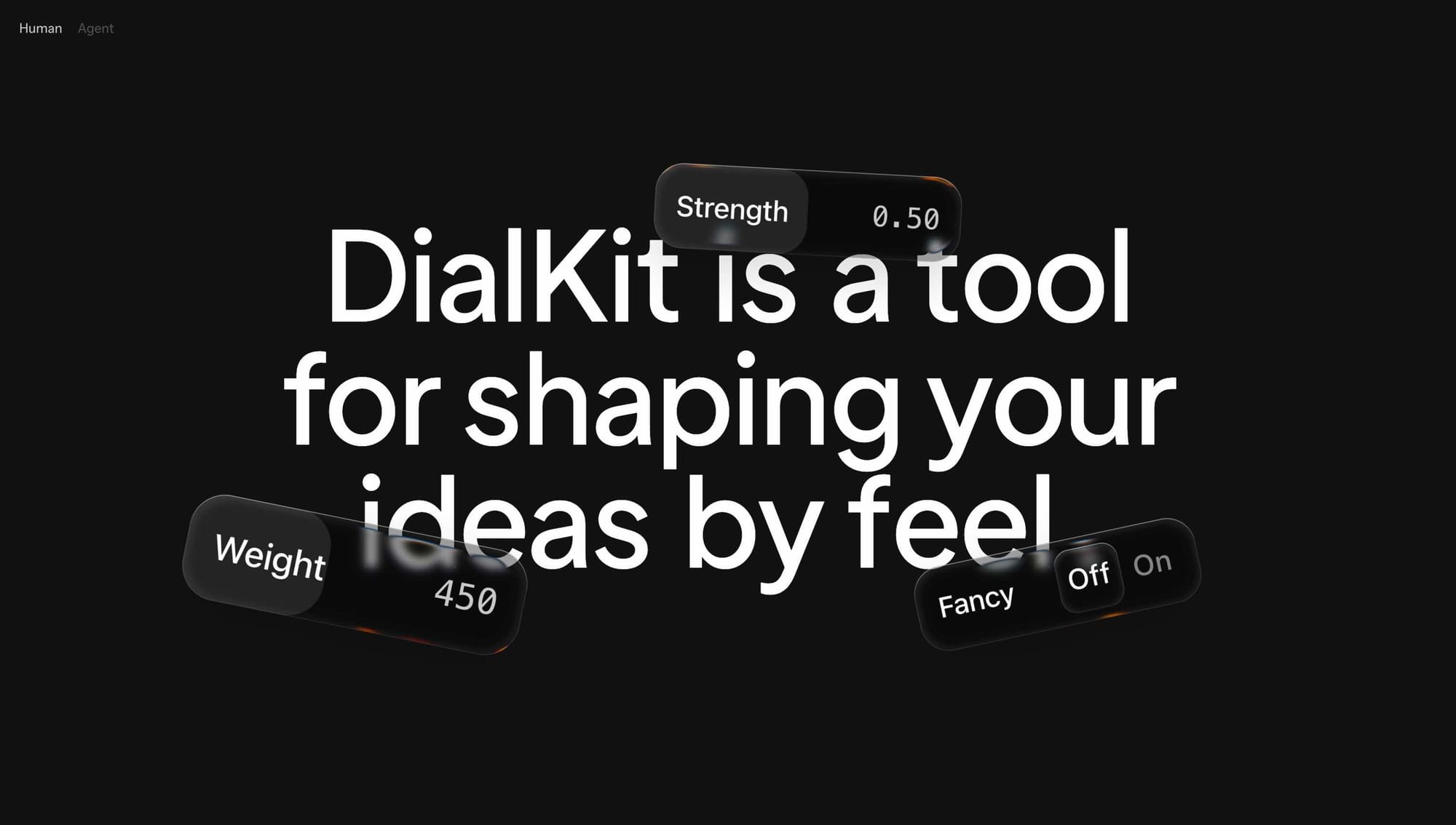
Setting up these controls takes time, so a control panel is most useful when you need to experiment repeatedly. For a one-off spacing adjustment, a direct edit may be quicker.
Figma remains a useful space to compare alternatives and work through visual details. If it’s where you work most fluently, use it; just track which decisions need to be implemented in code and how you’ll verify they’ve carried over.
Refine one example, then let the agent apply it broadly
Once you’ve refined the dashboard card and it looks and feels right, you have a specific decision the agent can apply to the relevant components.
After settling on a 16-pixel gap, for example, you could give this instruction:
In the shared DashboardCard component, change the gap between the heading and description from 24px to 16px, using the relevant spacing token. Apply this to the standard card variant, and review its uses on the Overview and Reports pages.
The component and page names here are placeholders. What matters most is specifying the exact element you want to change, the value you’ve selected, and the update’s scope. Whether it’s a single instance, a variant, or a shared token.
An agent can help update shared components, find related uses across the codebase, and identify places that might need a separate decision. You can focus your attention on how the change works in each context.
A card with a two-line heading or a longer description might behave differently from your initial example. Review the affected components with different content lengths and at narrow and wide screen widths. Focus on the places most likely to be affected.
Be clear about whether you’re changing a single instance, a component variant, or a shared design token. Choosing 16 pixels for this card doesn’t automatically make it the right gap everywhere.
Set the agent up for success with better context
Clear instructions and context at the outset help reduce corrections later.
Begin with your design system, key components, and useful references. A short set of guidelines can explain which spacing scale to use, how dense or open the interface should feel, and how headings, labels, and supporting text relate.
Examples help the agent understand your preferences. If you like the density of a particular settings panel, reference it and point out the relationships you want to carry over, such as the spacing between elements or their alignment. Annotated screenshots help make those details clear.
When requesting a correction, make the target easy to find: include the component path, name the screen, or mark the relevant element in a screenshot.
Agentation, for example, is a visual feedback tool that lets you annotate elements in a running interface. It turns your notes into structured context for coding agents. Depending on the output settings and what the page exposes, that context can include CSS selectors, component details, and source file paths. You can copy the feedback into your agent or connect it through MCP so the agent can read it directly.
This gives the agent a clearer target and helps you spend less time explaining which element you mean.
Leave space for design exploration
Different stages of design benefit from different approaches. Early on, you might use an agent to generate several layouts so you can compare directions. As the design becomes more resolved, direct adjustments can help you explore the details. Once you’ve made your decisions, the agent can help apply them consistently.
Moving between prompts, browser inspectors, code editors, and design tools gives you different ways to work through a problem. Choose the interaction that helps you make the next decision with confidence.